When The Details Are The Design
Guiding the successful use of a ubiquitous icon.
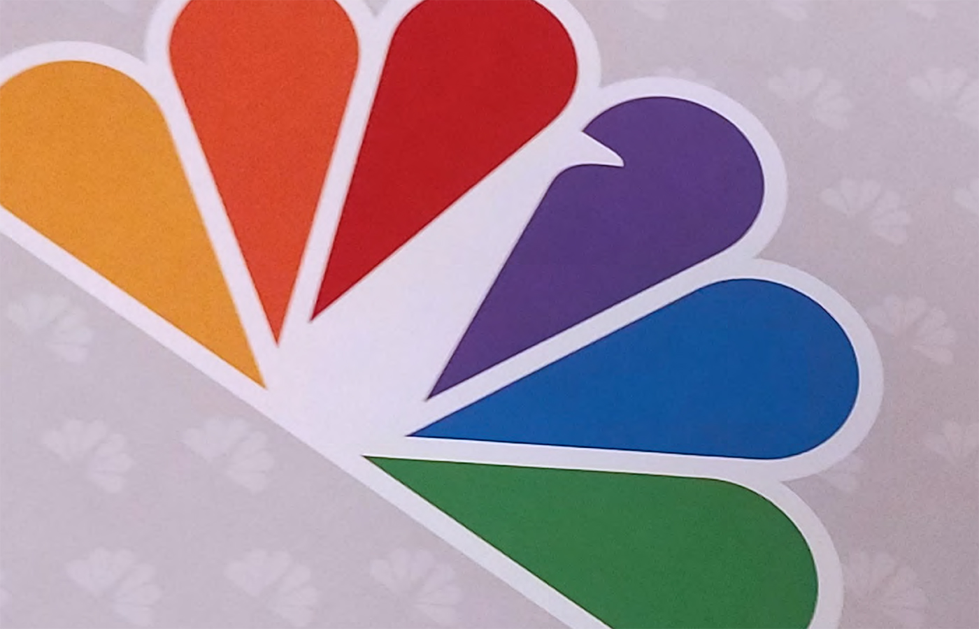
Born in 1956, refined and simplified through the years, the NBC peacock is a recognized symbol throughout the U.S. and beyond. And while the beautiful forms of the most recent version were created with purposeful intent, time and technology continue to evolve and affect how the icon is used and represented. Not only that, but with an organization as large as NBC the successful management around consistent reproduction of such a signature item is a constant challenge. And that’s where we come in.
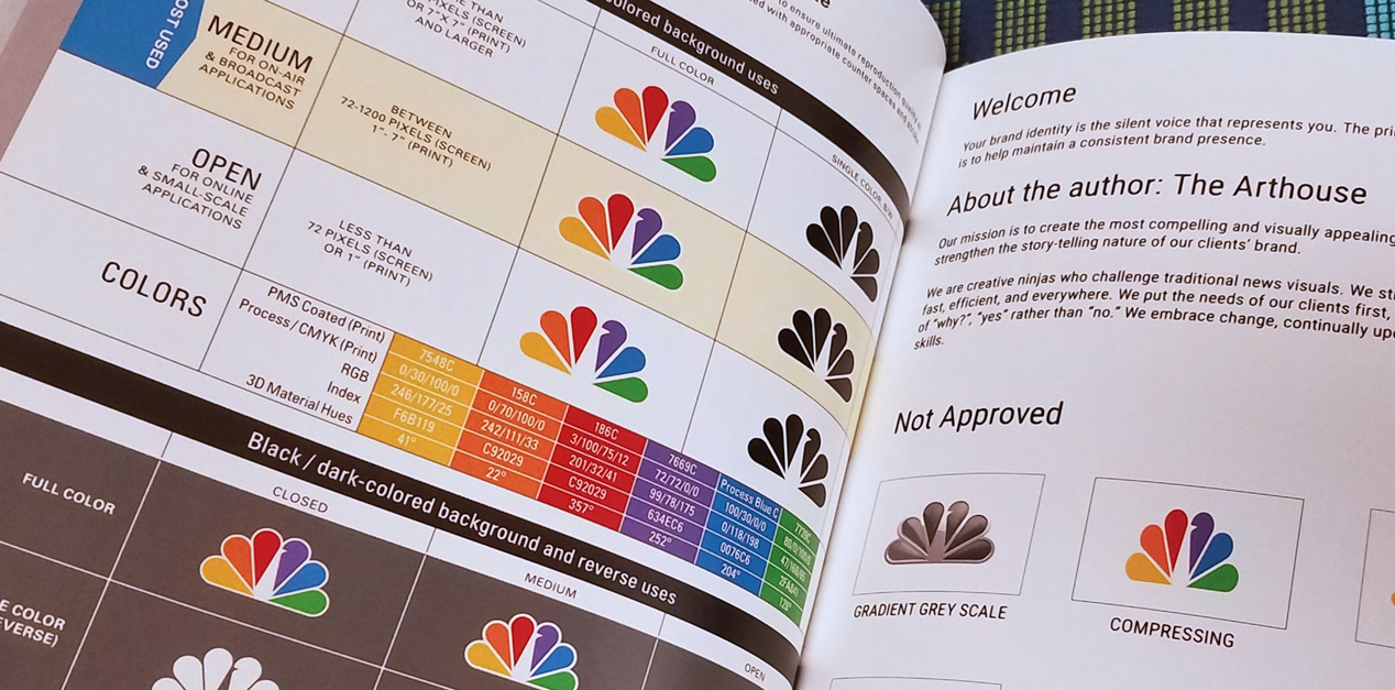
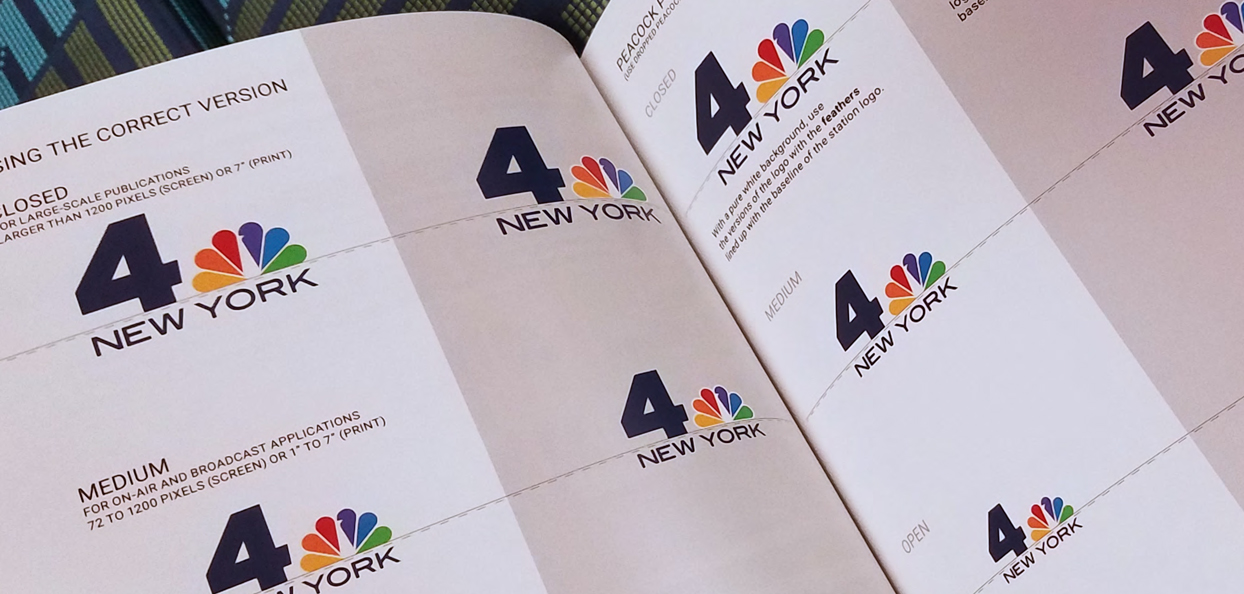
D+i was hired by The Arthouse, NBCUniversal Owned Television Station’s internal graphics department, to review their existing files, compare to original documentation of the Chermayeff and Geismar 1986 redesign and bring forward recommendations for formatting, versioning for scale and creating these versions to suit various uses.
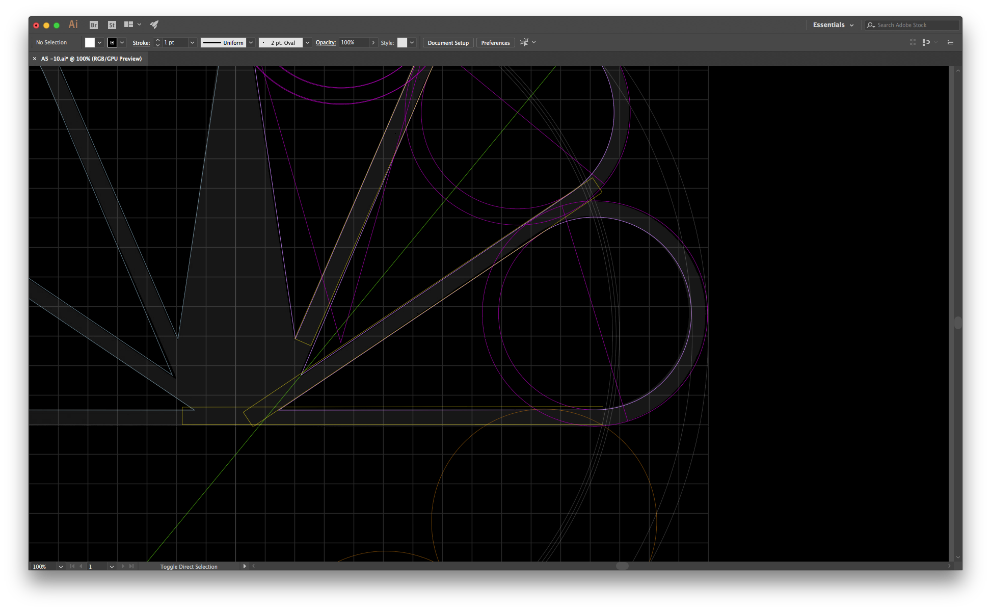
We worked in close collaboration with the resident NBC brand agent and logo historian at The ArtHouse to create 3 versions of the mark, each utilizing finely tuned negative spaces and adapted primary forms within the mark to define a balance between increased legibility and preservation of original intent. After several iterations, final versions of these files combined with recommendations for their use (based on media type and size) were delivered and wrapped into a formal guide to be distributed to stations under the NBC umbrella.
For design nerds this falls under the category of visual neuroticism at its finest. For the average viewer these subtle changes might evoke an increased feeling of quality or instill a brand takeaway that reinforces a level of professionalism for the organization it represents.
2 Minutes
Content: King or Killer?
TLDR
Limiting what you write can often be key to a better brand experience.
The SEO folks are going to hate me for this one, but in the case of impactful brand experiences less is often more. Great design experiences are all about simplicity, ease of understanding, and lasting impressions. Apple exemplifies how a company can lead the consumer through their entire brand experience with minimal content. From website, to in-store experience, all the way to how their products are packaged. When someone is faced with an overwhelming amount of content to sort through the experience can be less than pleasant and may be memorable in the wrong (think verbose and overwhelming) way.
However, we all know that the Google bots still need something to sink their teeth into – relevant and rich content that drives people to your site. So how do we find a middle ground that satisfies both needs?
Be concise, bold, bullet and have a reason for everything
Hierarchy and communication structure is essential to keeping the viewer interested. As opposed to writing long-winded, run-on sentences of filler and fluff it’s important to ask yourself: what is the purpose of the piece – is it to inform and educate? What are you trying to get the reader to do – be driven to a specific action? What should they walk away with – renewed awareness of the brand?
In today’s society the public is familiar with their content being delivered in small bite-sized chunks. Use this knowledge to guide your writing and help break down a lengthy and potentially unreadable article into something they can absorb. Something that tempts the reader into viewing, allows them to engage at a level that suits them, and ultimately gives them something to walk away with.
Another guideline is to utilize an appropriate amount of content per the medium you are operating in. Twitter vs. email. Website vs. banner ad. Brochure vs. billboard. Each medium has a different purpose with a different length of engagement from the reader and should be utilized as such. Using the right messages in the right places can direct your client through the communications path in the most beneficial way.
Hire a copywriter
Good writing not only captures and maintains audience attention, but also consistently delivers on and reinforces the tone of your brand. D+i often creates messaging suggestions and tone guidelines as a part of an overall brand guidelines document, but it is essential that these attributes are applied in a smart and consistent way to establish a strong brand voice.
If you don’t have the ability to do this in house it’s smart to hire someone to do it for you and do it well. Whether the need is to maintain an online voice across social media platforms or to establish structure and tone through a brochure or your website copy, having someone on board who is intimately connected to your brand voice will ensure successful copy that tells the right story while delivering on your brand promise and marketplace differentiators. Copywriters can come in many forms; from an independent contractor with specialization in an industry vertical to a social media content creator within a PR firm and everything in between. Be sure to choose the appropriate match for your need.
Succinctly put
To avoid the risk of making my own mistakes I’ll wrap this up and leave you with this. Good content is always better than more content. Hire the right people. Be thoughtful, purposeful and leave your audience wanting more.
4 Minutes
Propelling the outdoor industry
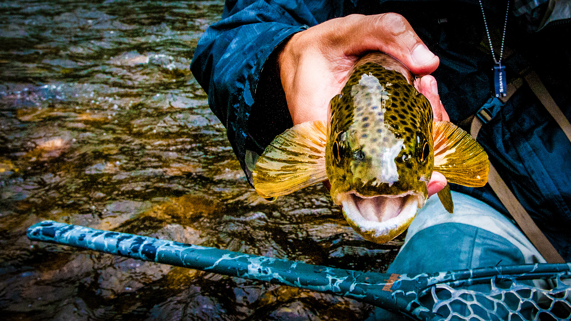
As a company based in Denver, our team is comprised of a melting pot of outdoor enthusiasts.
From mountain biking and skiing to rock climbing and fly-fishing, our team members embrace the Colorado stereotype of maintaining an active, outdoor lifestyle in our 300+ days of sunshine each year.
As such, we are always eager to work with brands who share our passion for the outdoors. These brands share the challenge of solving an unanswered problem for outdoor enthusiasts. We partner with them to help identify and verbalize the problem and design a path to communicating its solution.
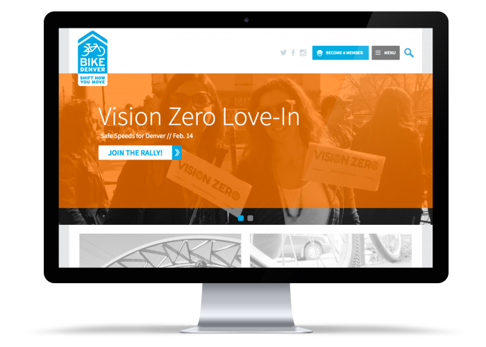
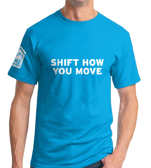
BikeDenver is a membership-supported organization that advocates for bicycle safety, accessibility and education across the Denver community. The organization recognized the need for Denver bicyclists to have a platform to discuss issues, share knowledge, and advocate for change. We partnered with BikeDenver to conceptualize a brand identity, positioning and tone-of-voice that engaged with this community and positioned the organization as a key resource. We then design a user-friendly website where this target audience could collaborate, educate themselves and engage with BikeDenver staff. These efforts fueled an increase in membership numbers and ultimately a continuous improvement of cycling infrastructure in and around Denver creating a bike-friendly city for years to come that will encourage individuals to Shift How You Move.
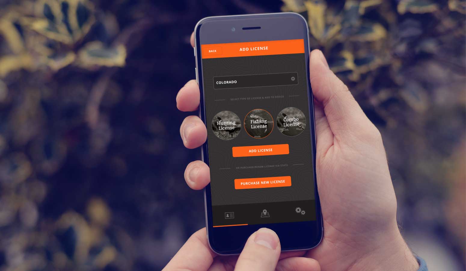
Digitizing licenses
While embracing the outdoors used to be seen as a ‘back to basics’, no frills experience, advancements in technology have spurred more and more outdoor sportsmen and women to utilize gadgets, online resources and applications to improve safety, convenience, and efficiency in the outdoors.
While the outdoor industry continued to be more technology-centric, certain areas remain outdated. Managing hunting and fishing licenses was one of these areas, and the Pursuit team recognized this. Hunters and Fishermen were still tasked with carrying physical copies of their licenses when in the field and organizing licenses by state as well as expiration date. The team at Pursuit approached us with the idea for a mobile application where electronic copies of these licenses were stored. We approached this engagement by first developing an understanding of the target audience. We realized that users needed to not only store, but organize, manage and renew licenses on a regular basis. We approached UX design for the mobile application with this need in mind, ensuring it was simple, intuitive and easy to navigate with the tap of a finger.
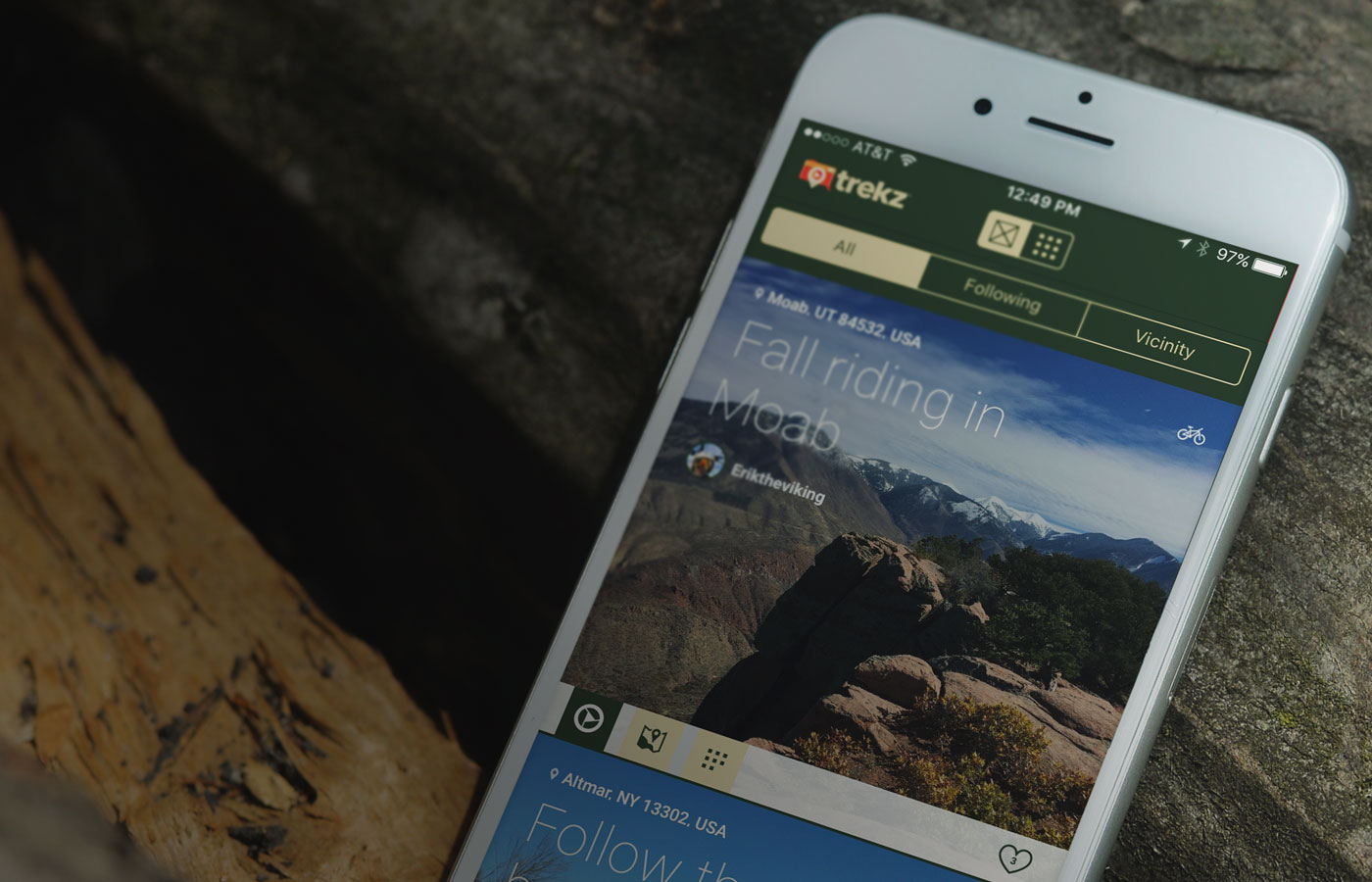
Sharing adventure
Trekz approached us with an idea for a mobile application that created a space for outdoor adventurers to come together and share their experiences with like-minded users.
While certain mobile apps offered a tool for mapping the location of a hike or sharing photos from a journey, there was a void for an application which connecting photos with GPS coordinates as well as a first-hand story account. We collaborated with the Trekz team to build off of this need. We knew our target audience not only wanted to share their adventures, but also experience the journeys of others in a story-like fashion. We designed the application to present information like a magazine article, using editorial design cues to encourage users to immerse themselves in the journeys of others in an exciting and interactive way.
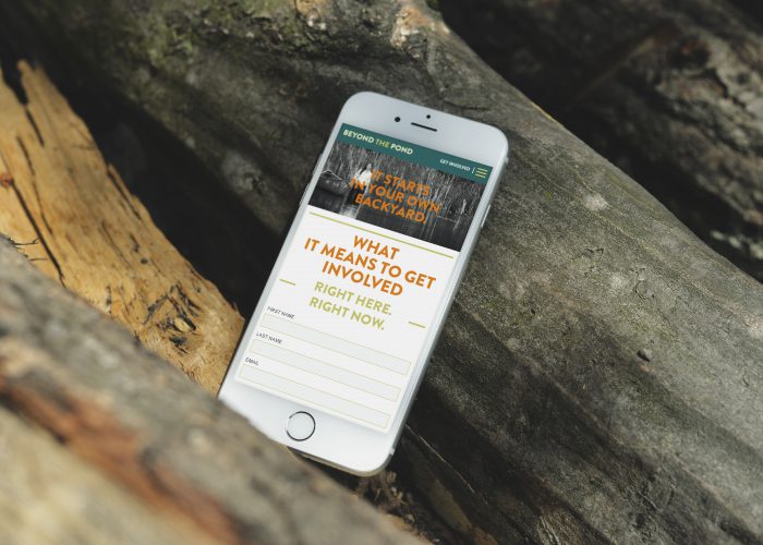
Funding fish habitat
The National Fish Habitat Partnership (NFHP) is a government entity funded by the Division of Fish and Wildlife. NFHP oversees fish habitat partnerships across the country, however the government funding it receives is not enough to effectively fund the 19 partnerships it manages.
NFHP came to us with the need to generate additional funding sources that could serve as an additional funding source for the individual partners. After conducting stakeholder interviews, we determined that a separate, branded funding entity was needed that communicated how funds were allocated and emphasized how these funds were used – specifically on the conservation and ecosystem health level. We conceptualized a name and identity for the funding entity – Beyond The Pond – whose message was that aquatic ecosystem health – from fish to wildlife to chemical makeup – was essential to the population as well as wildlife. The Beyond The Pond brand proved to be hugely successful in securing new funders and generating awareness.
Innovating the outdoors
Whether it be a non-profit organization, mobile application or retail brand, the outdoor industry continues to draw interest and support across the globe, and brands are looking for innovative ways to engage with users and improve outdoor adventures and experiences. We take pride in partnering with them to accomplish this, and seeing the final product in action when we’re playing outdoors in the diversity of our own Colorado backyard is the ultimate reward.
6 Minutes
A Dynamic Environmental Experience
From first impressions to lasting impressions.
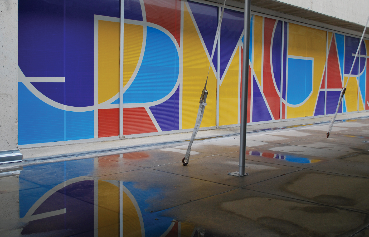
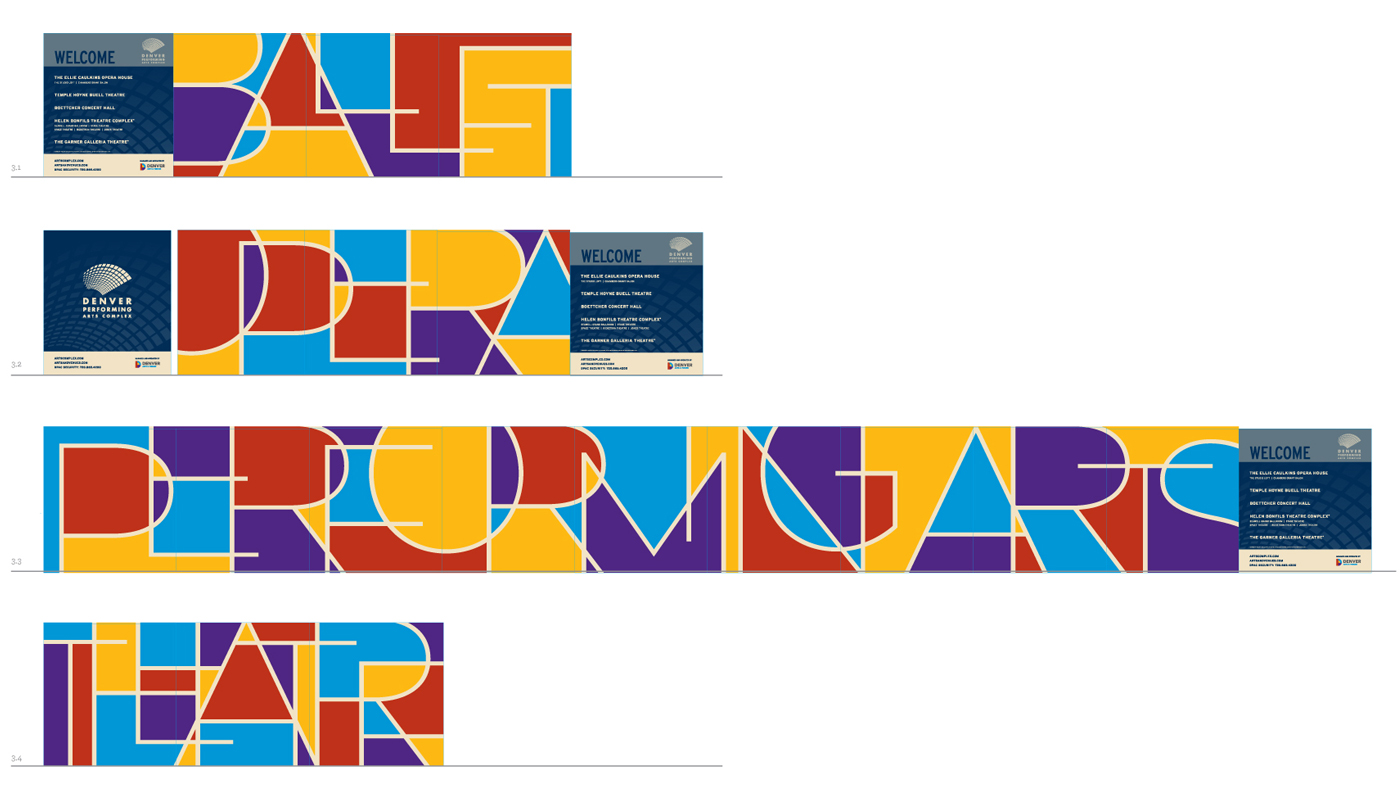
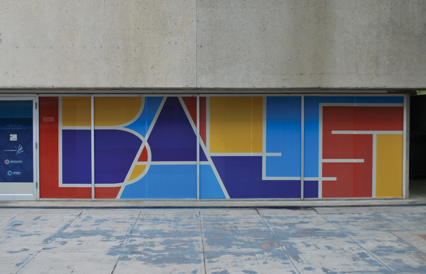
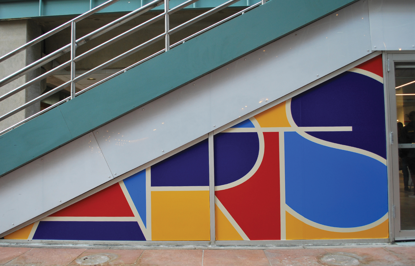
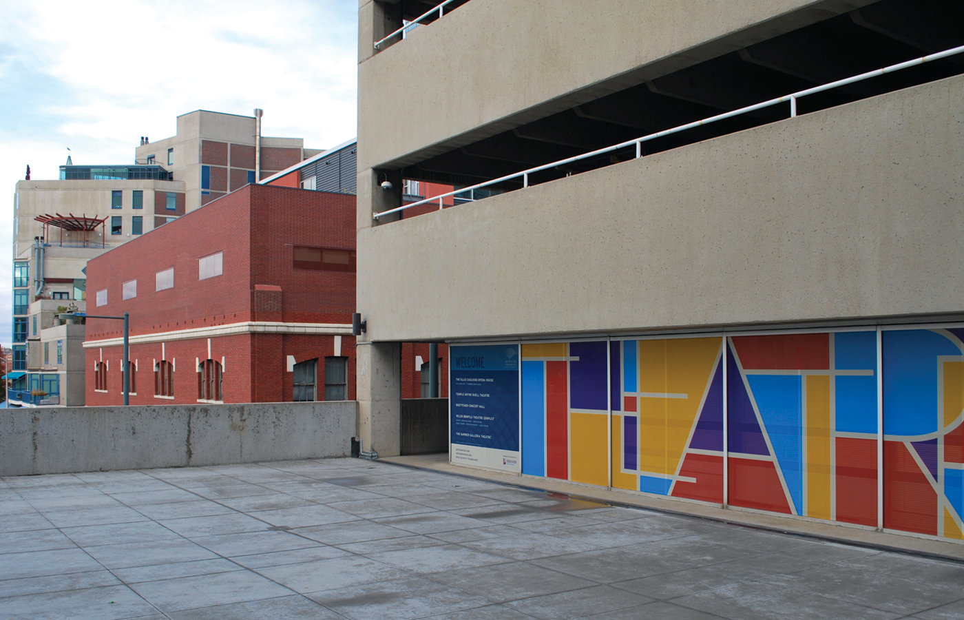
D+i was tasked with the challenge of updating the environmental graphics throughout the Denver Performing Arts Center space. Through creative exploration and collaboration with the Arts & Venues team we settled upon a solution that utilized custom typography to reflect the use of the multiple theaters within the space.
Words that reflect the primary residents of the space, and the nature of the events that occur here were styled in a way that visually describe the movement and dynamic impressions that an attendee would experience, employing multiple bold colors to create an energized and modern stained-glass effect. The graphics are applied across the majority of glass surfaces within the complex, from the parking garage where attendees first enter, to storefronts and throughout the interior to tie together this shared arts space in a cohesive way.
D+i took this large-scale challenge in stride, organizing the process with site visits and planograms to ensure variety in form, message and accuracy in final application, as seen in the time-lapse video of the install (after the images below).
1 Minutes
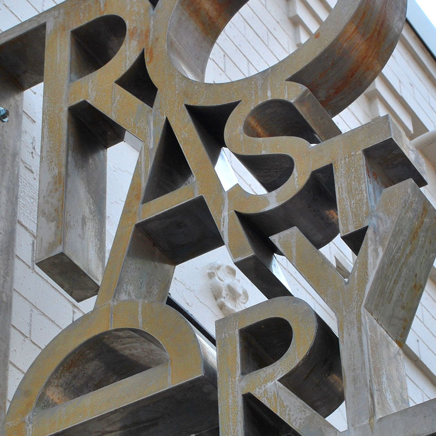
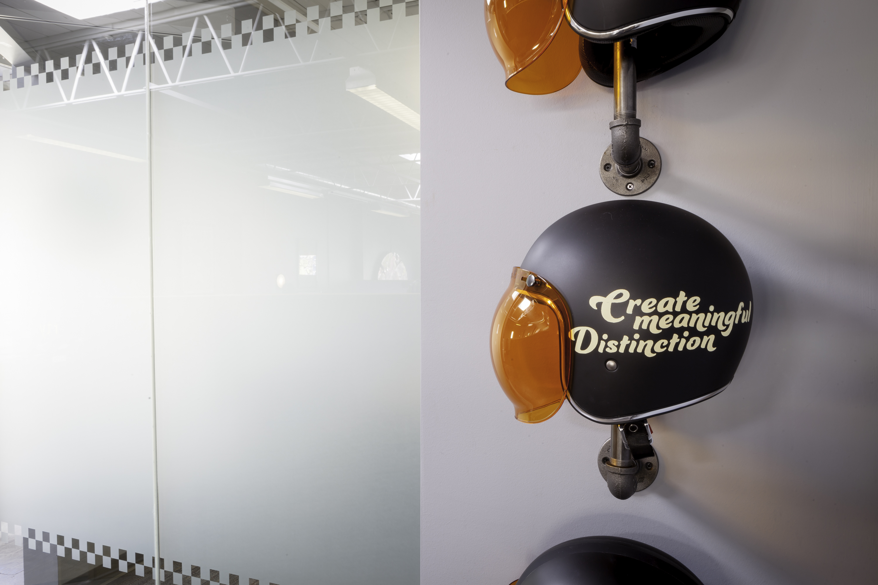
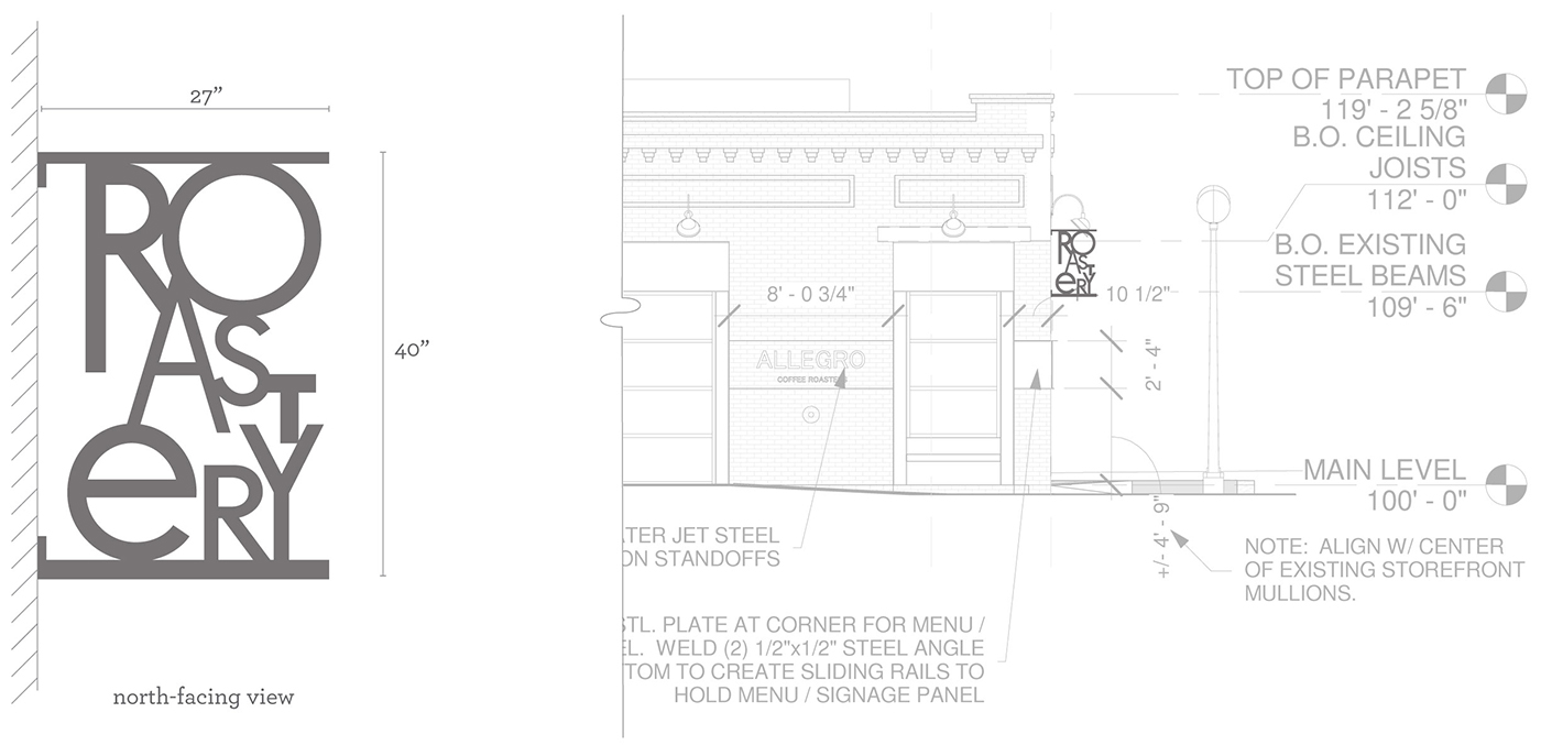
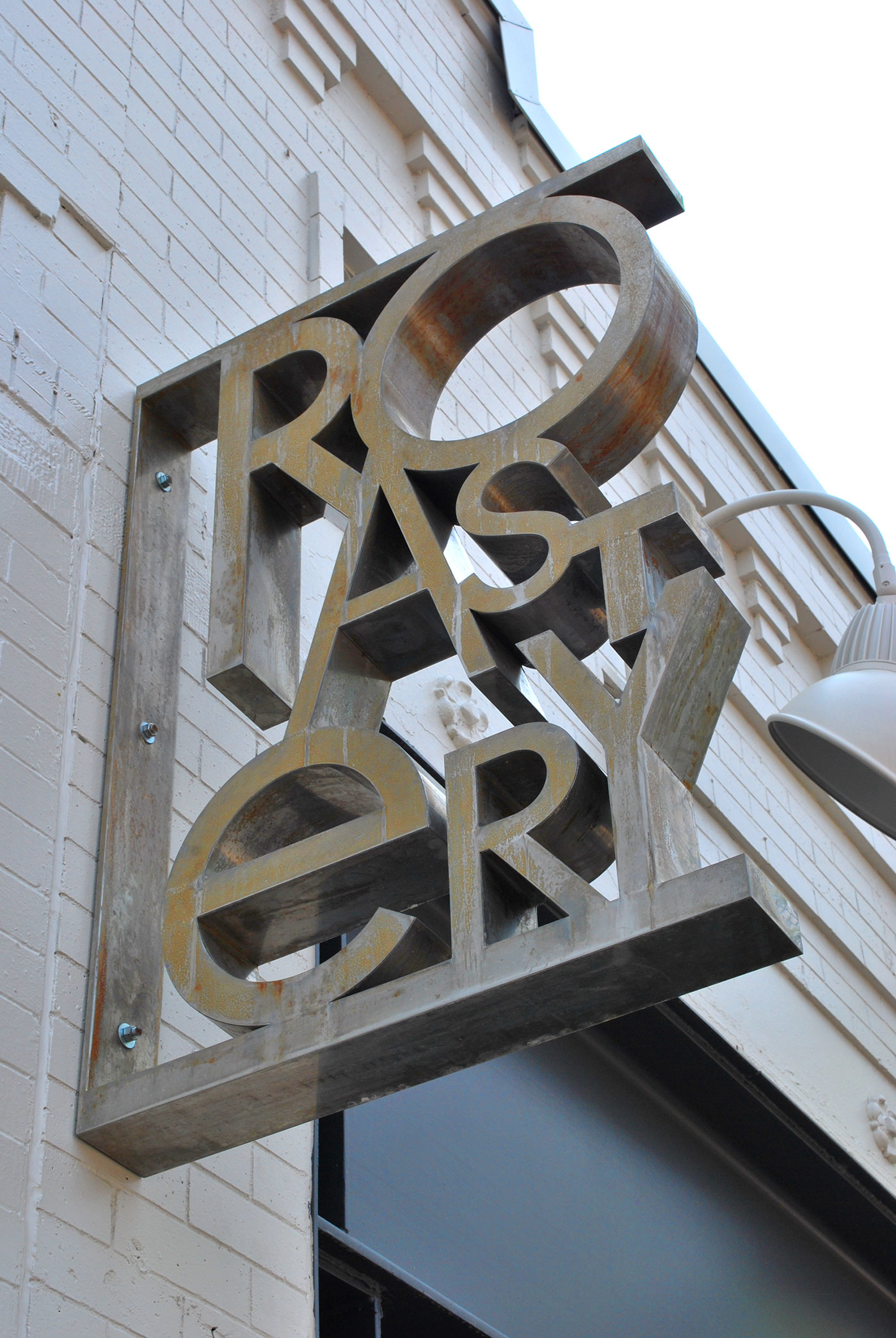
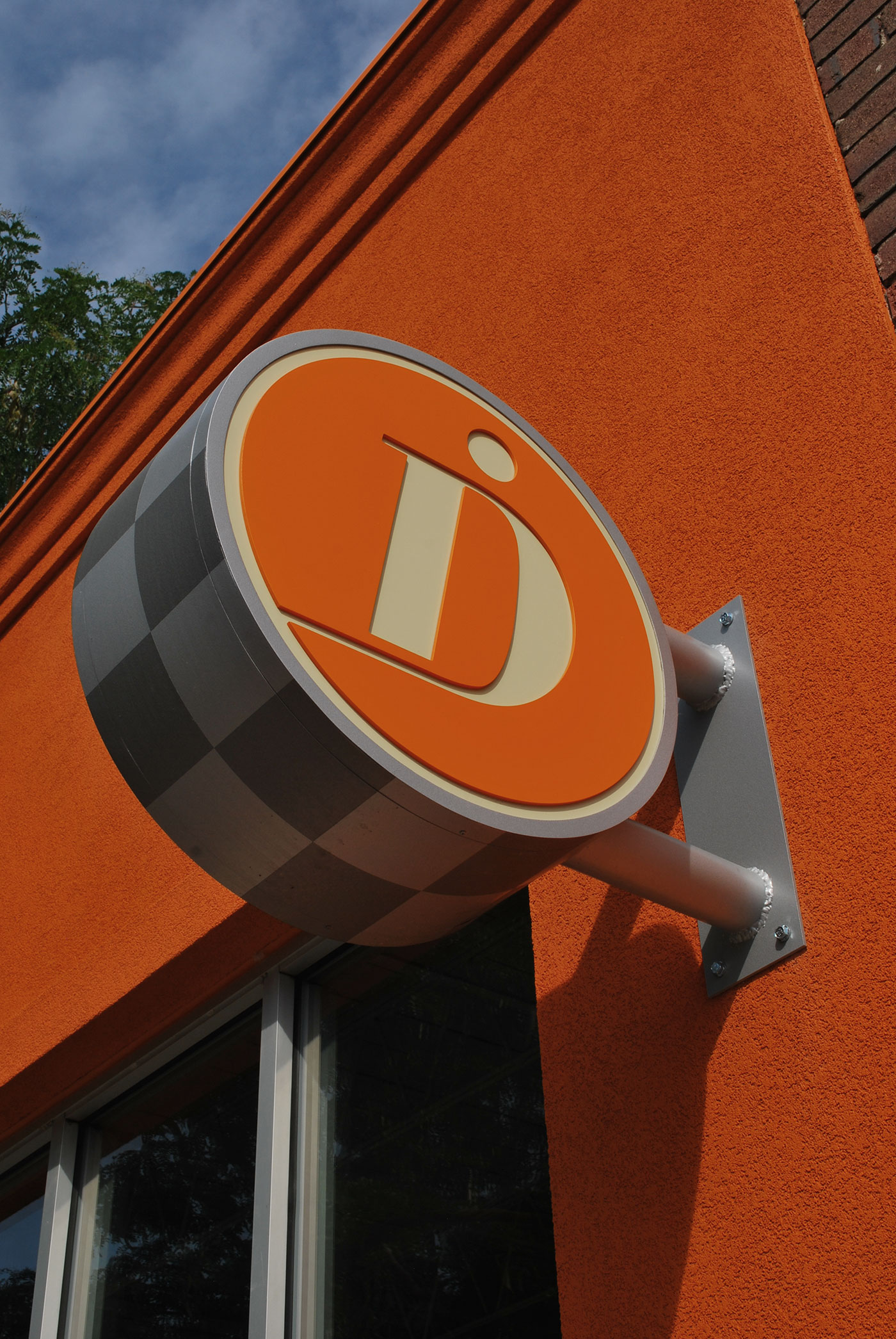
Expressing Your Brand Inside and Out
Signs are much more than just a large version of your logo.
The launch of a new position in your marketplace can be exciting and sometimes a little daunting, especially when the visual expression of the brand is new, refreshed or changed entirely. An essential part of a successful launch is to make sure everyone involved (from employees to potential customers and partners) has something they can stand behind — and stand for. Infusing this visual expression into your environment in a way that is unapologetic and proud creates ownership and impact in a way that no other element of your brand can.
D+i, along with it’s fabrication partners is adept at creating an appropriate three-dimensional expression of your brand identity that will resonate both internally and externally, creating a sense of place and belonging. Not only that, but what better way to show your company pride than a 3 foot high logo? Here’s some examples of 3-D expression in action.
1 Minutes
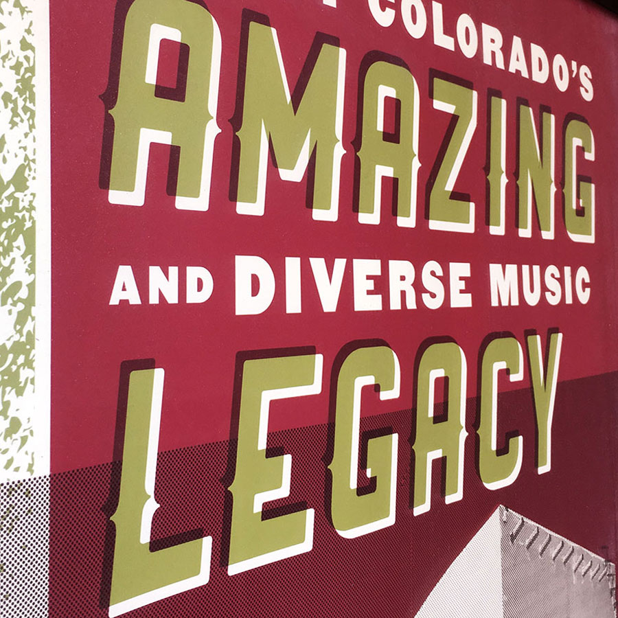
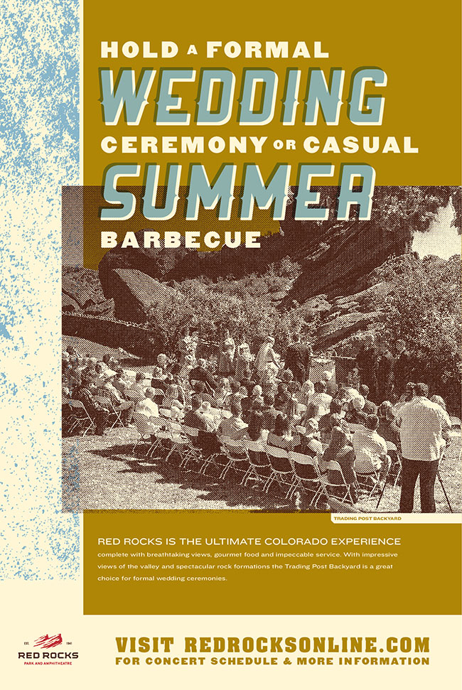
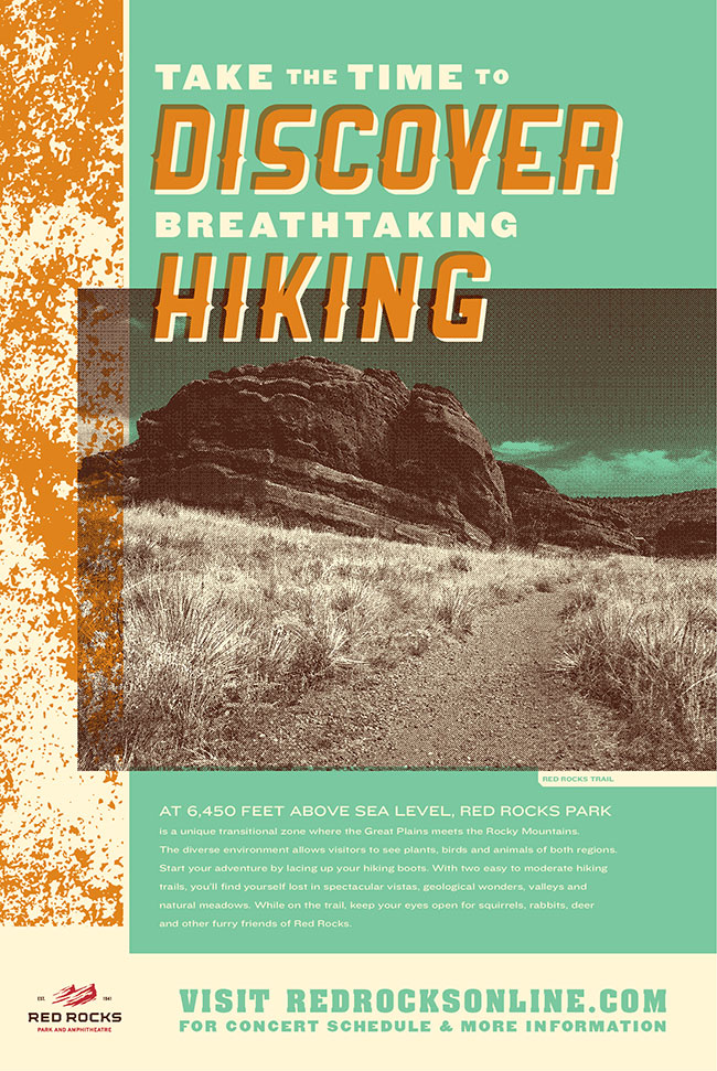
Old Fashioned Consumer Awareness
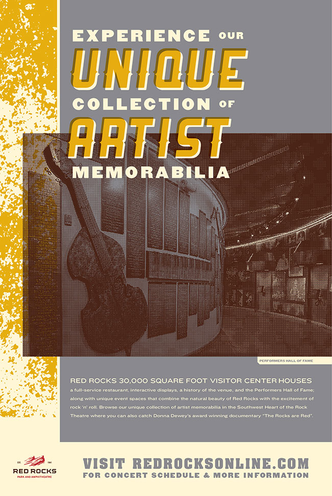
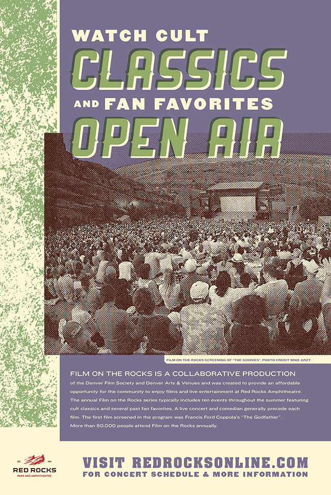
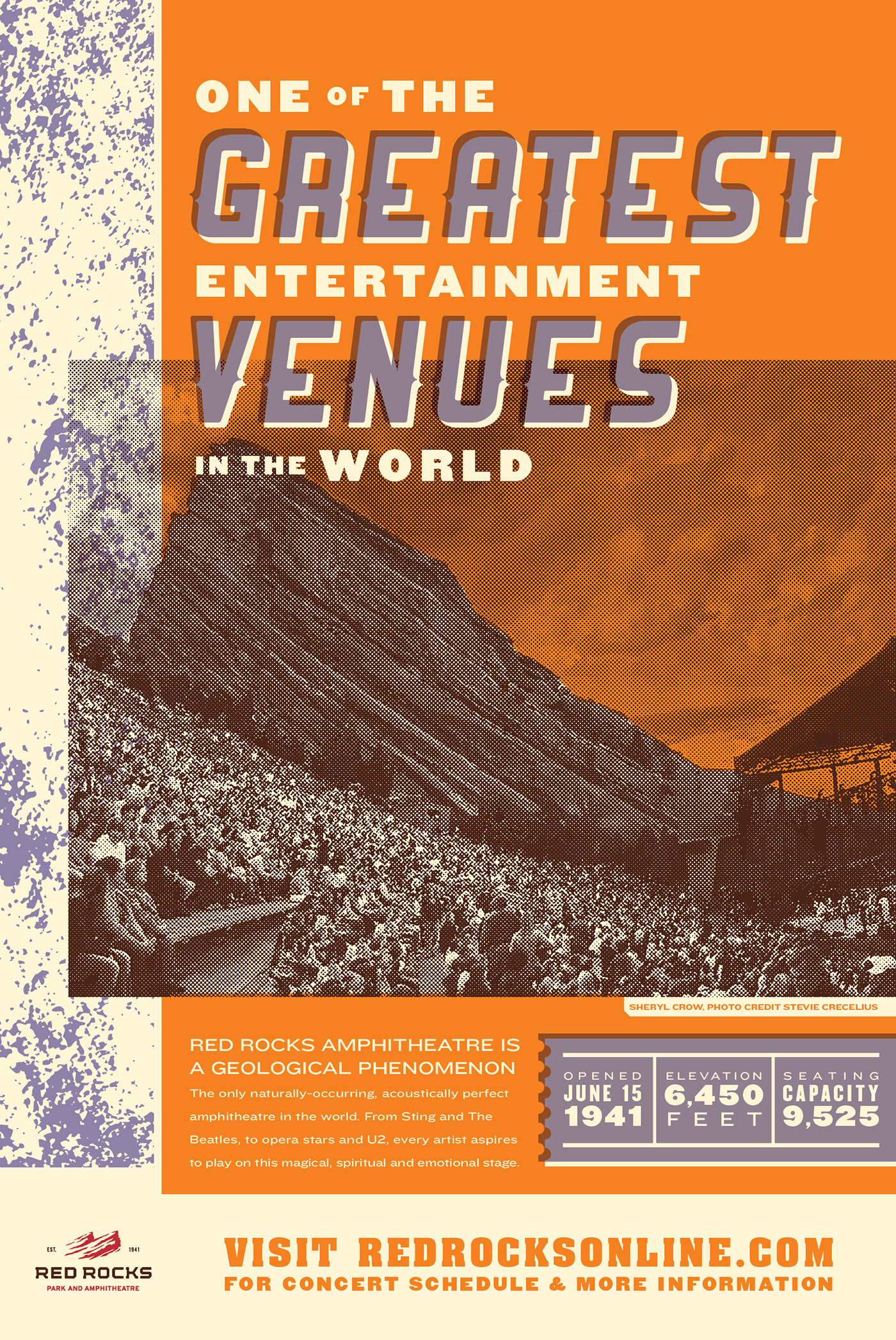
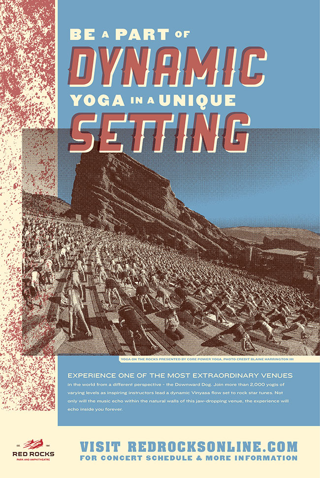
Poster Series for Red Rocks Amphitheatre
When a venue has been around for 75 years consumer perception of its brand and functional attributes can get a little stale and one-dimensional. Red Rocks Amphitheater, while well known for its ability to host amazing musical performances, also has the ability to host many other types of events, from weddings to Mothers Day brunches, and embrace a variety of visitor types from tourist visits, to hiking and biking within the park boundaries.
D+i created a series of posters that outline the variety of ways that consumers can utilize the places and spaces within this venue. Through compelling copy and a striking visual style that harps back to rock posters and older printing techniques we were able to create multiple points of engagement that inform the viewer about the many aspects of Red Rocks available to enjoy.
1 Minutes
24-7 Creativity
Facilitating ownership and inspiration
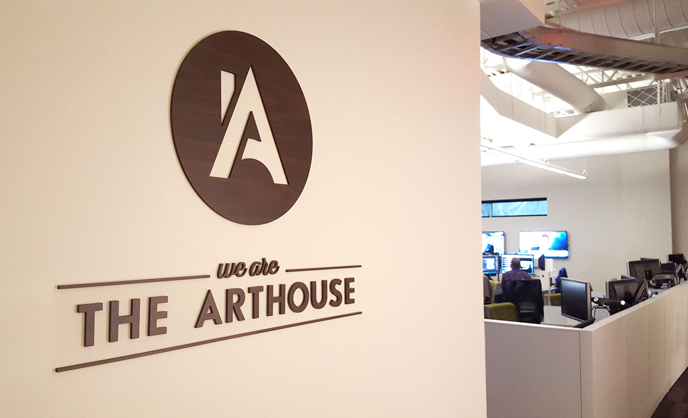
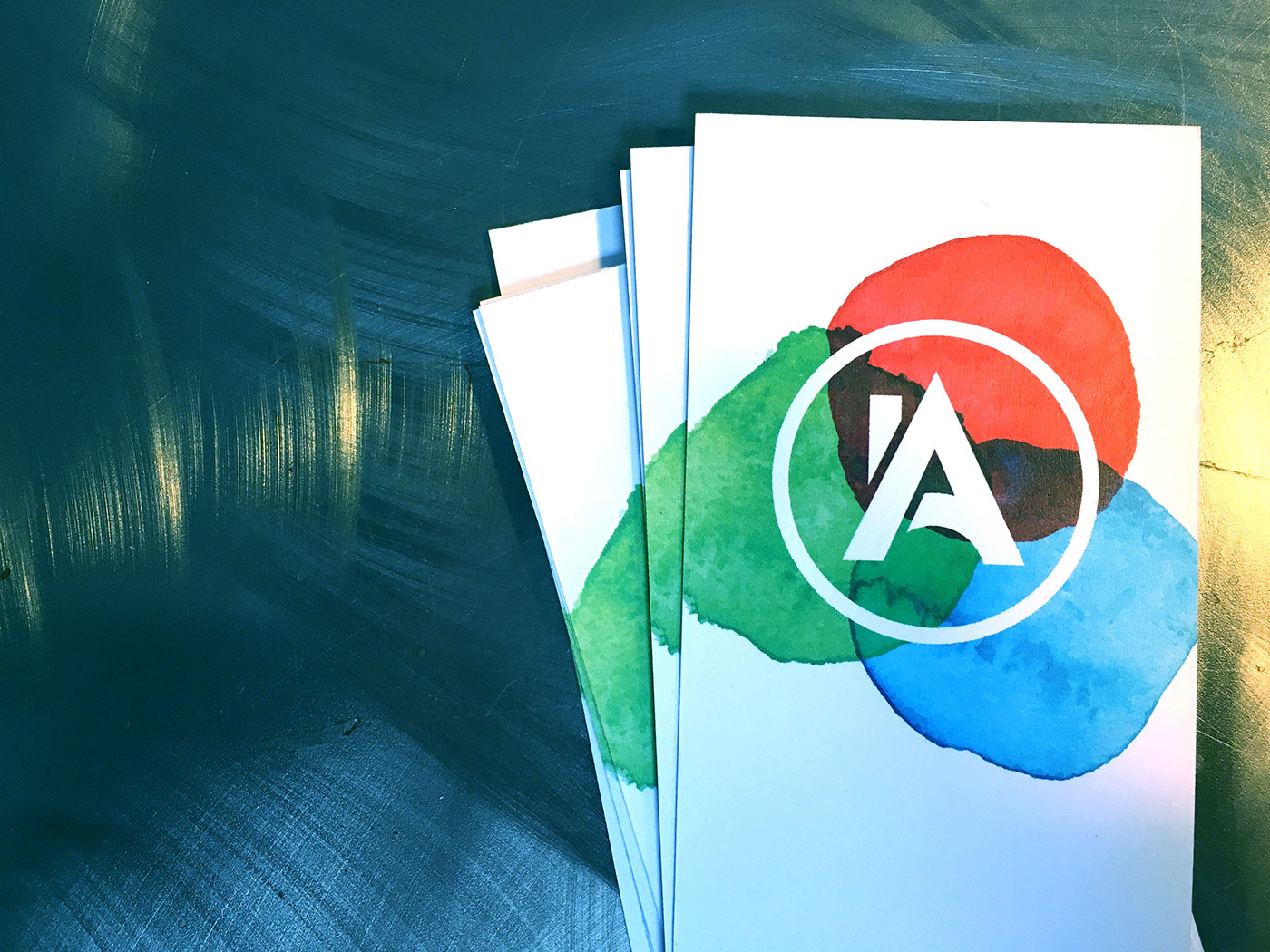
It’s always a challenge to achieve alignment and consensus within any organization, but how do you do find the time to complete this task with a team that is engaged with their work around the clock? D+i Creative was hired by the NBC Owned Stations Group to guide their internal design team (that supports newscasts with digital graphic assets nationwide), breed a sense of ownership around a new name, and ultimately inspire and empower the creation of a new identity for their department.
D+i collaborated with our strategic partner Darwin to conduct a two-day series of on-site, facilitated workshops, each including a brand components backgrounder and various team exercises to achieve discussion and consensus around central themes. From this we were able to create a strategic plan and provide some essential communication tactics that would set a foundation to inform the creative work that would follow.
Ultimately the NBC team achieved success with an identity they could own, a pride in their department and new clarity around communication to audiences internally and externally, describing exactly what they do in one consistent and unified voice. We are The Arthouse!
1 Minutes
A Rebellious Team Engagement
From boring to badass
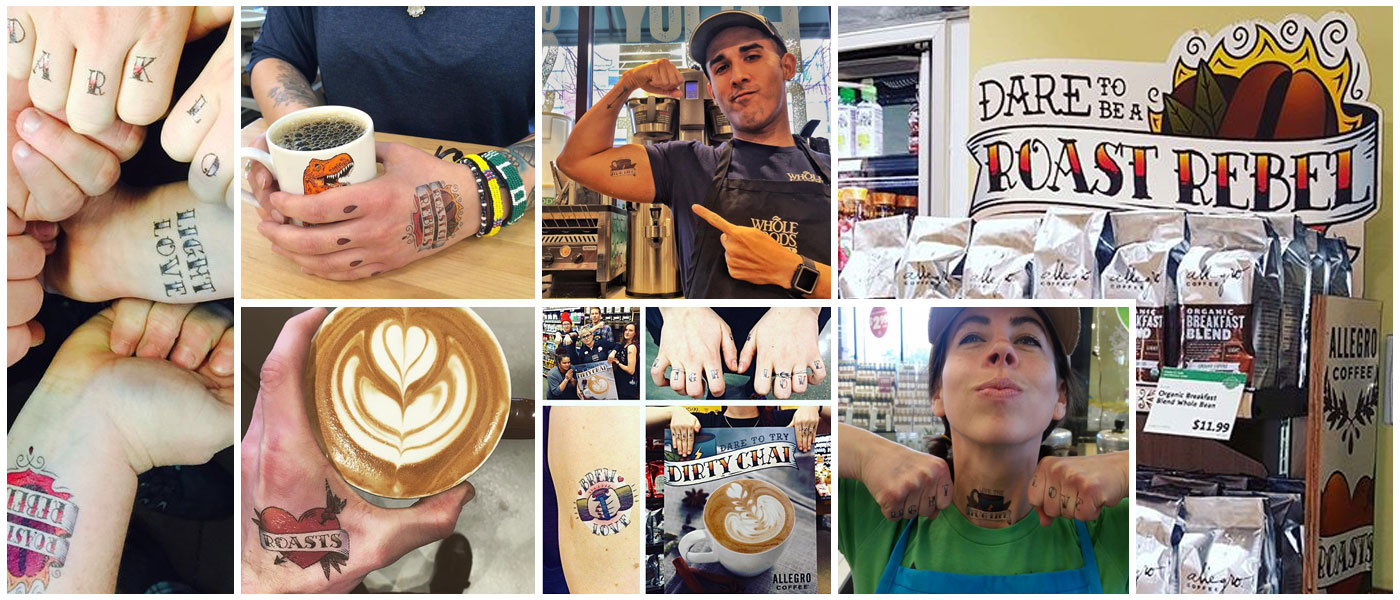
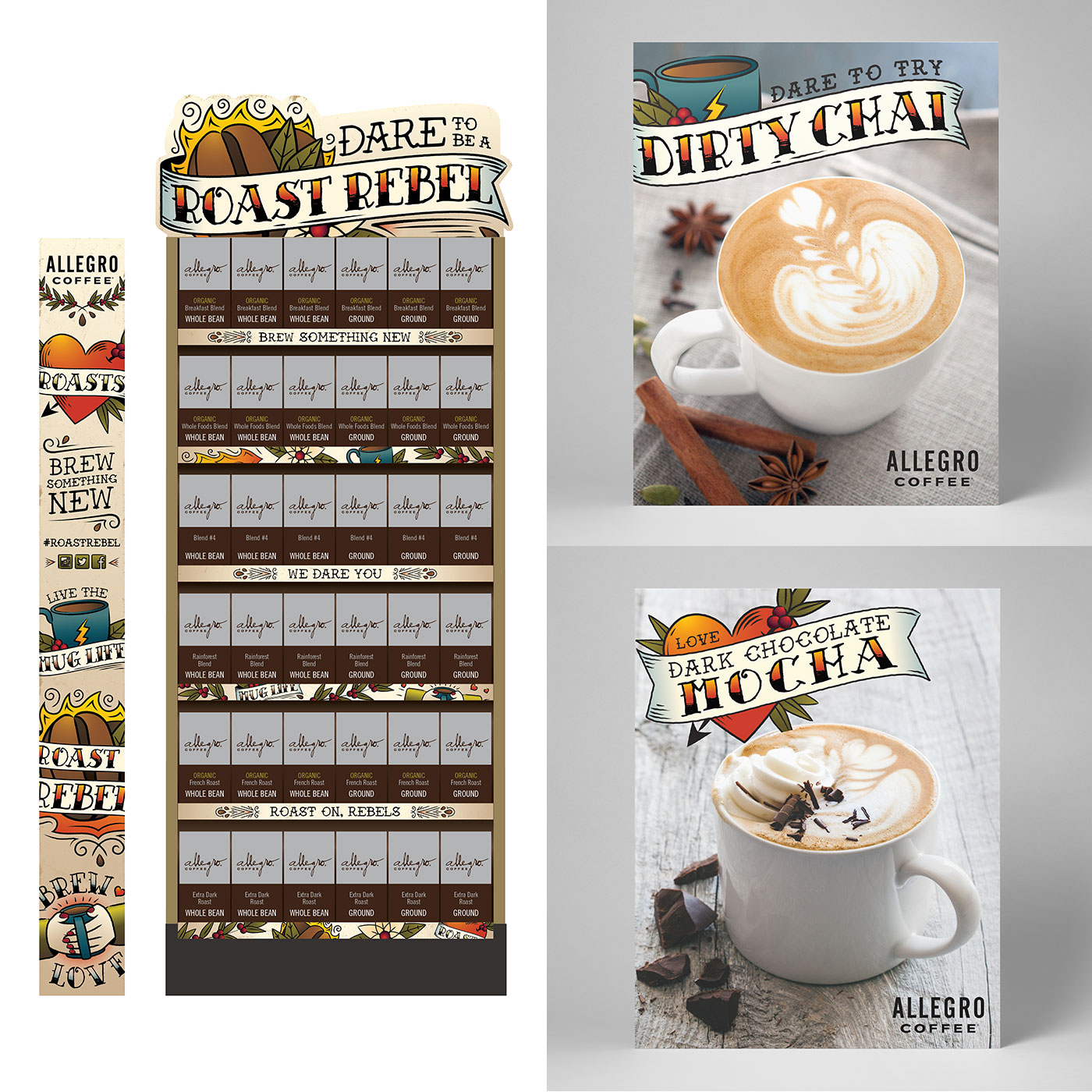
Through their seasonal promotion in Whole Foods Market, Allegro Coffee wanted to celebrate the diversity of their roast offerings. We collaborated to create a campaign encouraging consumers to take a risk by trying a new roast, brewing something new and experiencing a different flavor profile. Whole Foods team members and baristas were invited to share and encourage the rebellious spirit through cheeky temporary tattoos capturing the essence of a daring coffee experience with the hash tag #roastrebel. Roast on, rebels!
1 Minute
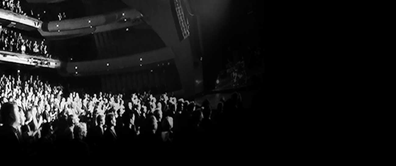
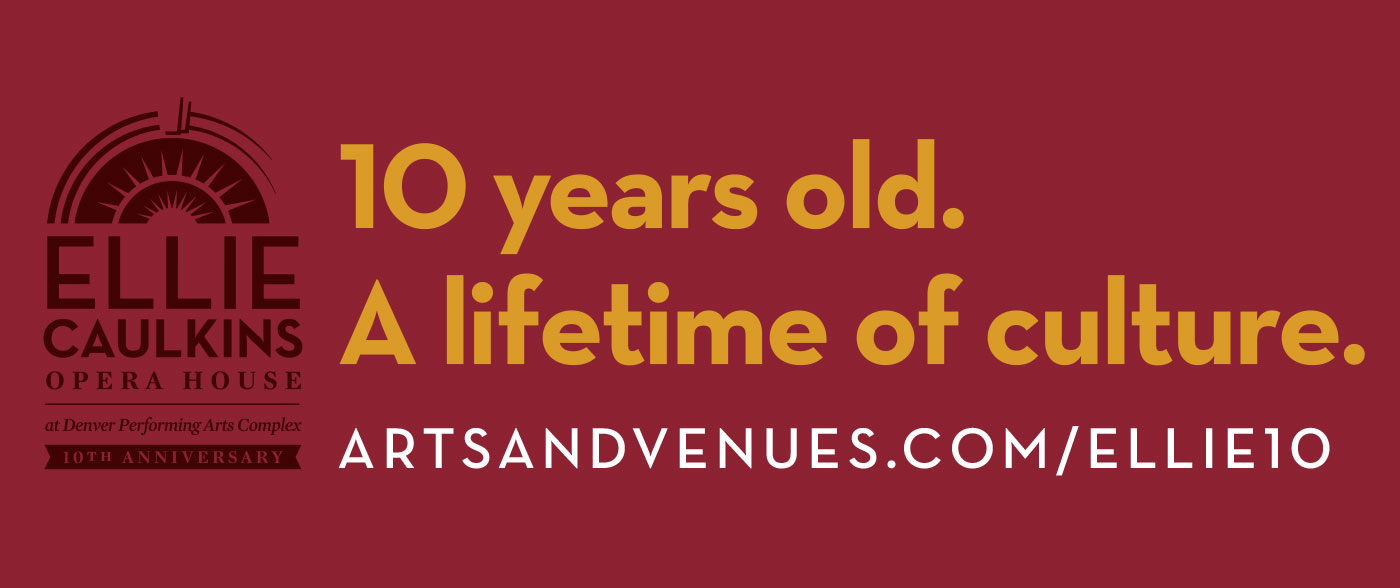
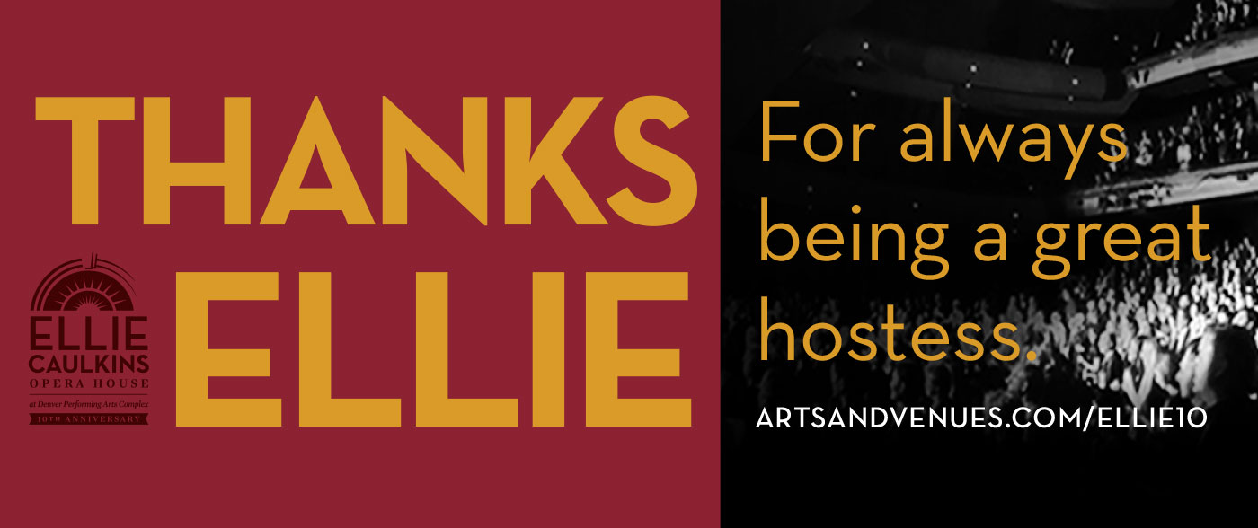
Ellie Caulkins Opera House 10th Anniversary
“Thanks Ellie”
After D+i improved the logo to include 25th anniversary commemoration, A&V asked us to assist in designing a campaign to build public exposure and awareness of the iconic Ellie Caulkins Opera House. With a primary goal to direct viewers online to learn more about history of the building, new and old, through photos and a deeper story, D+i concepted an original campaign, applying an approachable personality to the venue with a more obvious nod to the namesake of the theater. Through the line, “Thanks Ellie”, we show appreciation for the benefits of wonderful performances present, past and future we are able to experience because The Ellie is there to house them.
1 Minute
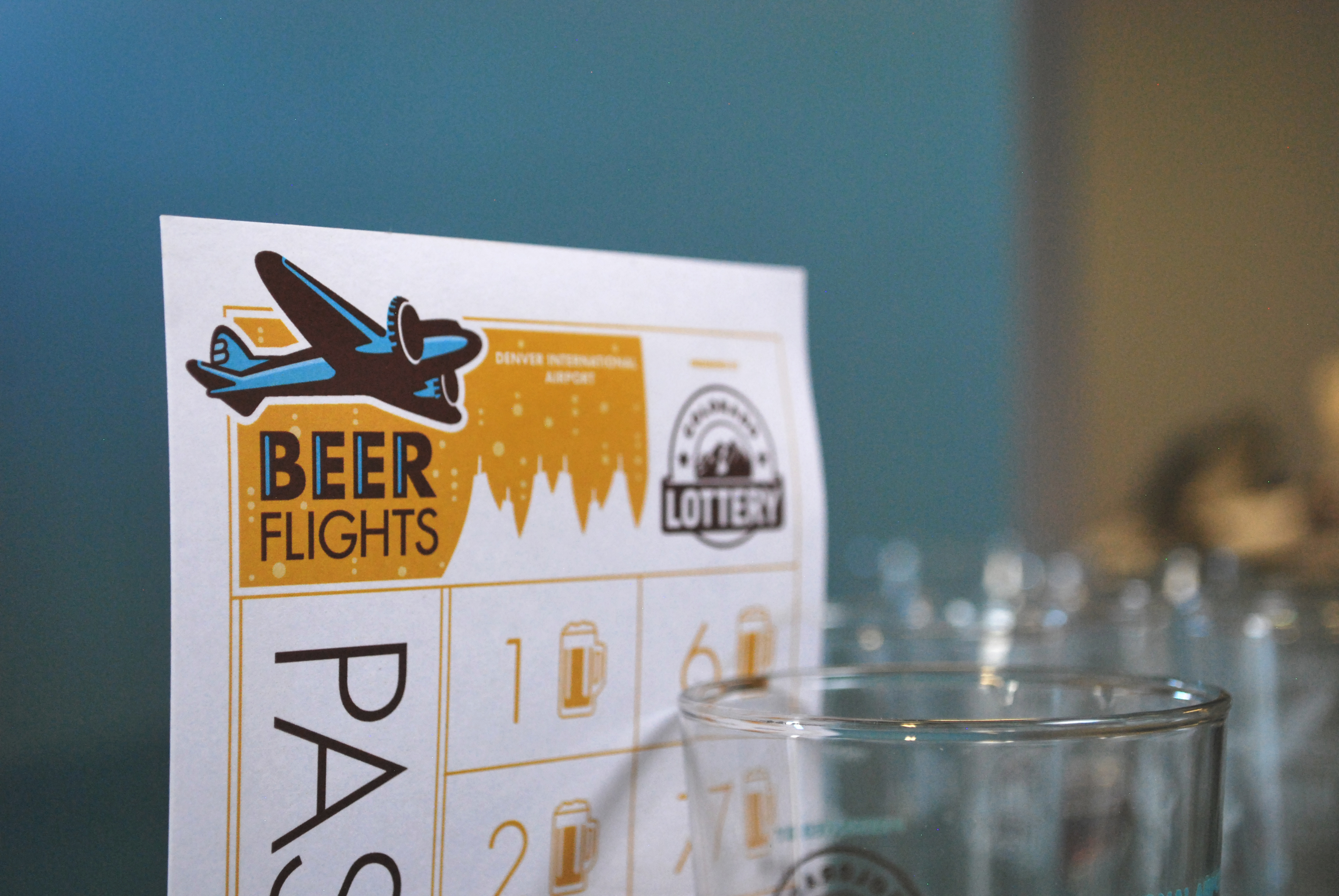
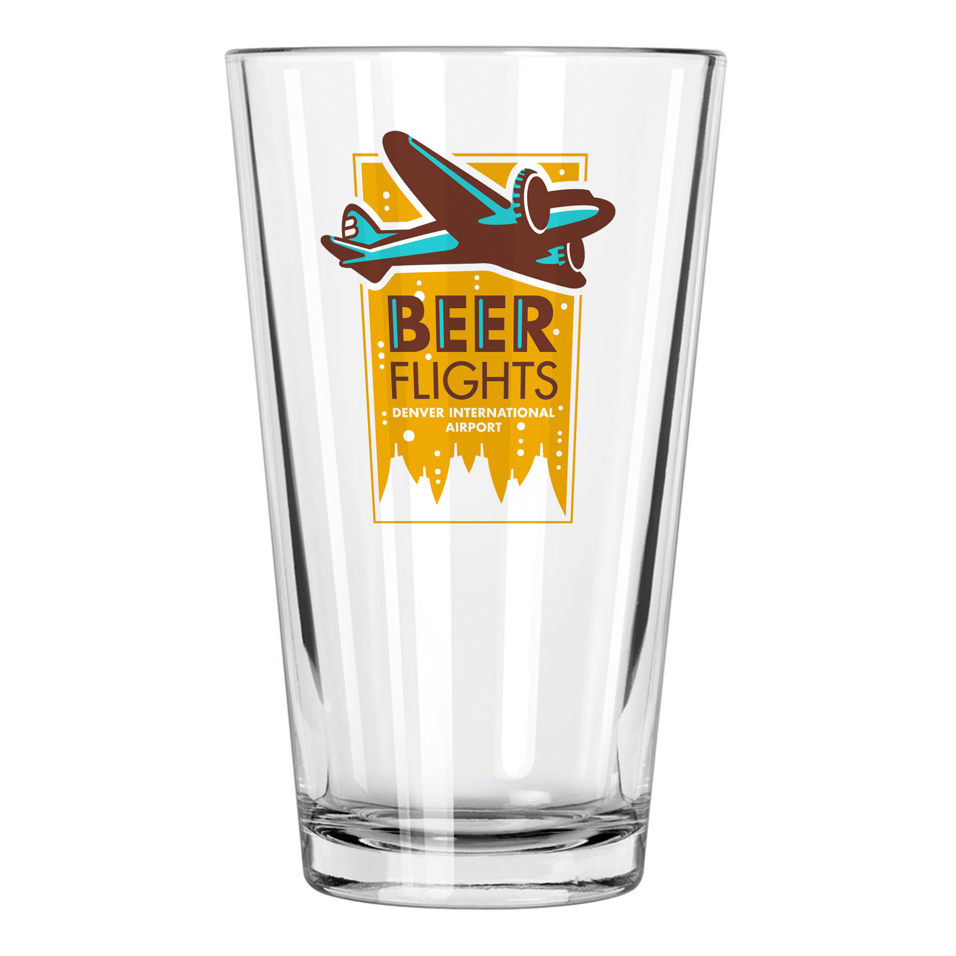
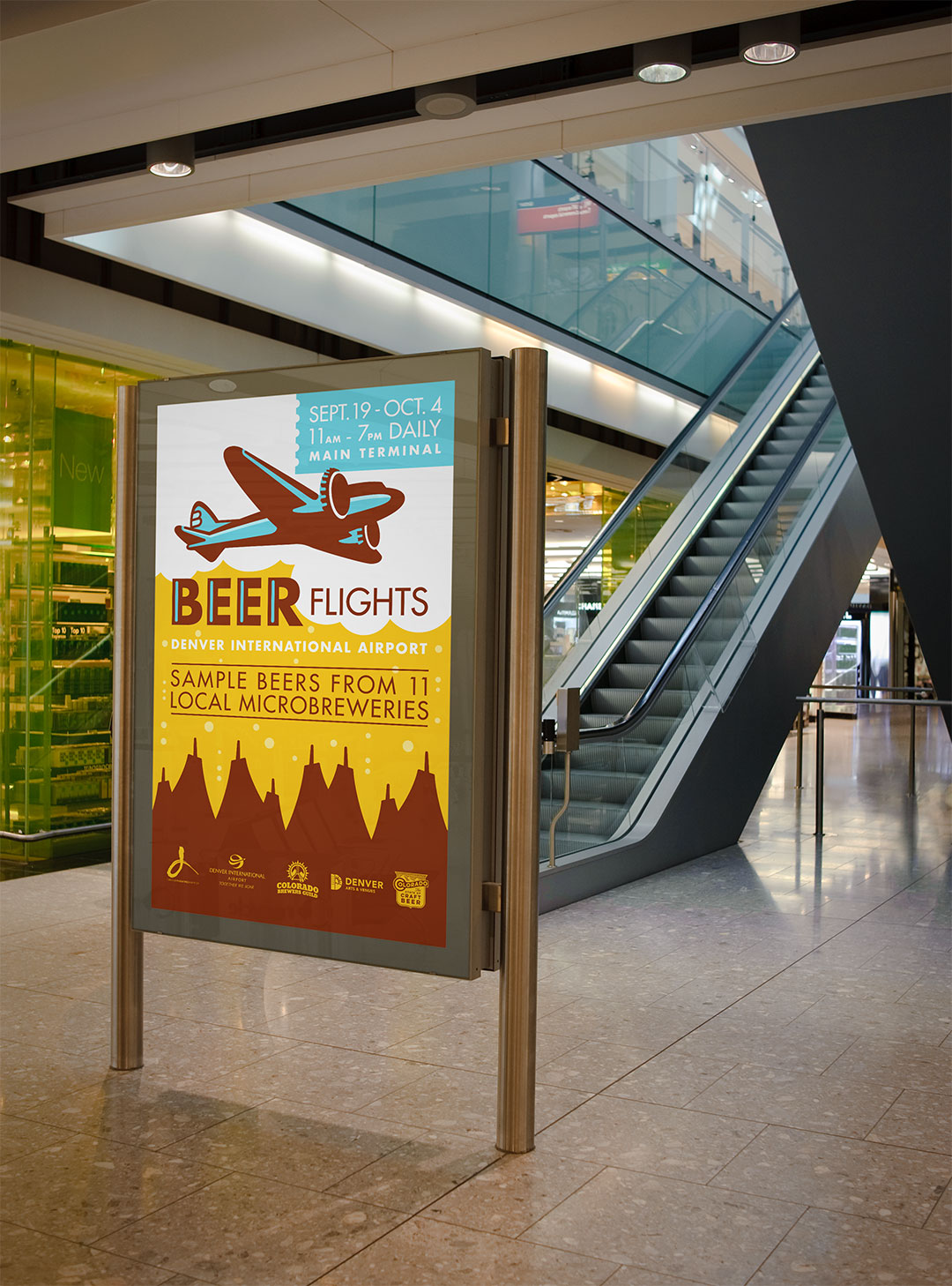
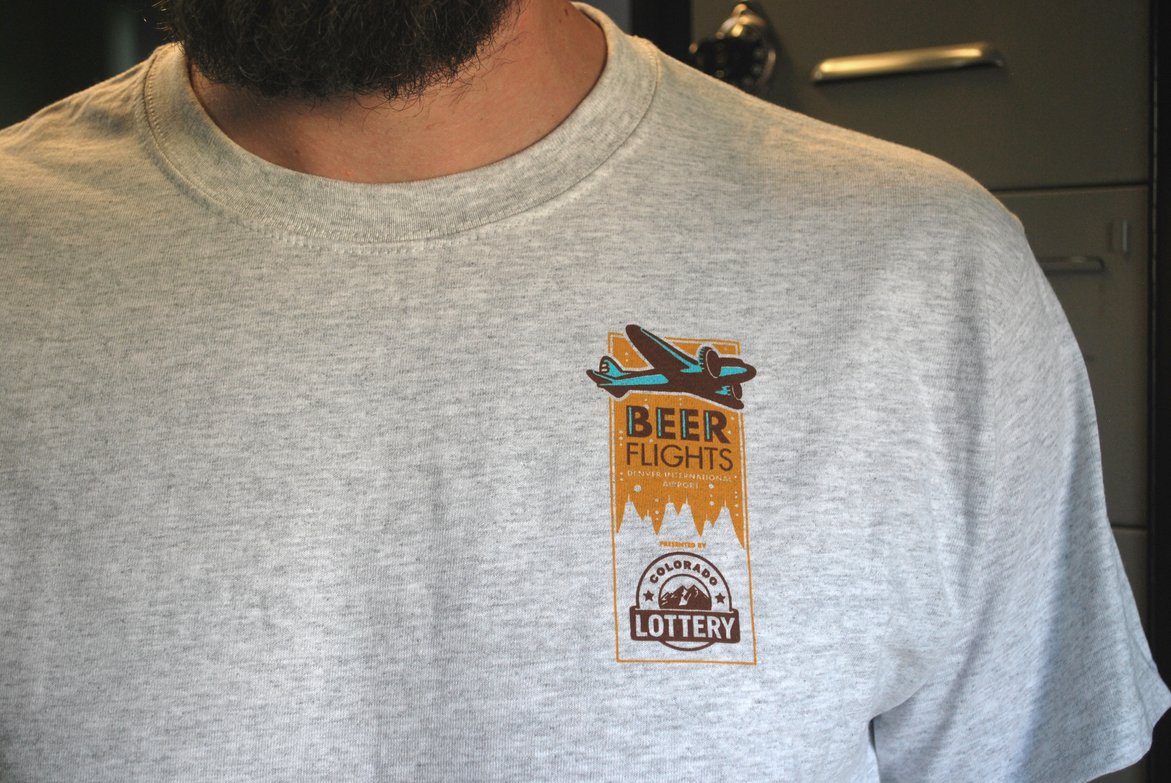
Beer Flights at DIA
Denver’s annual beer garden at DIA
Each year in early fall the Great American Beer Festival comes to town, and along with it many visitors traveling through the Denver airport. We worked closely with Denver Arts & Venues and DIA to ideate a temporary beer-tasting event at the airport called Beer Flights. Introduced by a unique identity and tied together with a warm, welcoming color palette that evokes the flavors of beer, the event has been a great success for the past two years running.
1 Minute