Guiding the successful use of a ubiquitous icon.
Born in 1956, refined and simplified through the years, the NBC peacock is a recognized symbol throughout the U.S. and beyond. And while the beautiful forms of the most recent version were created with purposeful intent, time and technology continue to evolve and affect how the icon is used and represented. Not only that, but with an organization as large as NBC the successful management around consistent reproduction of such a signature item is a constant challenge. And that’s where we come in.
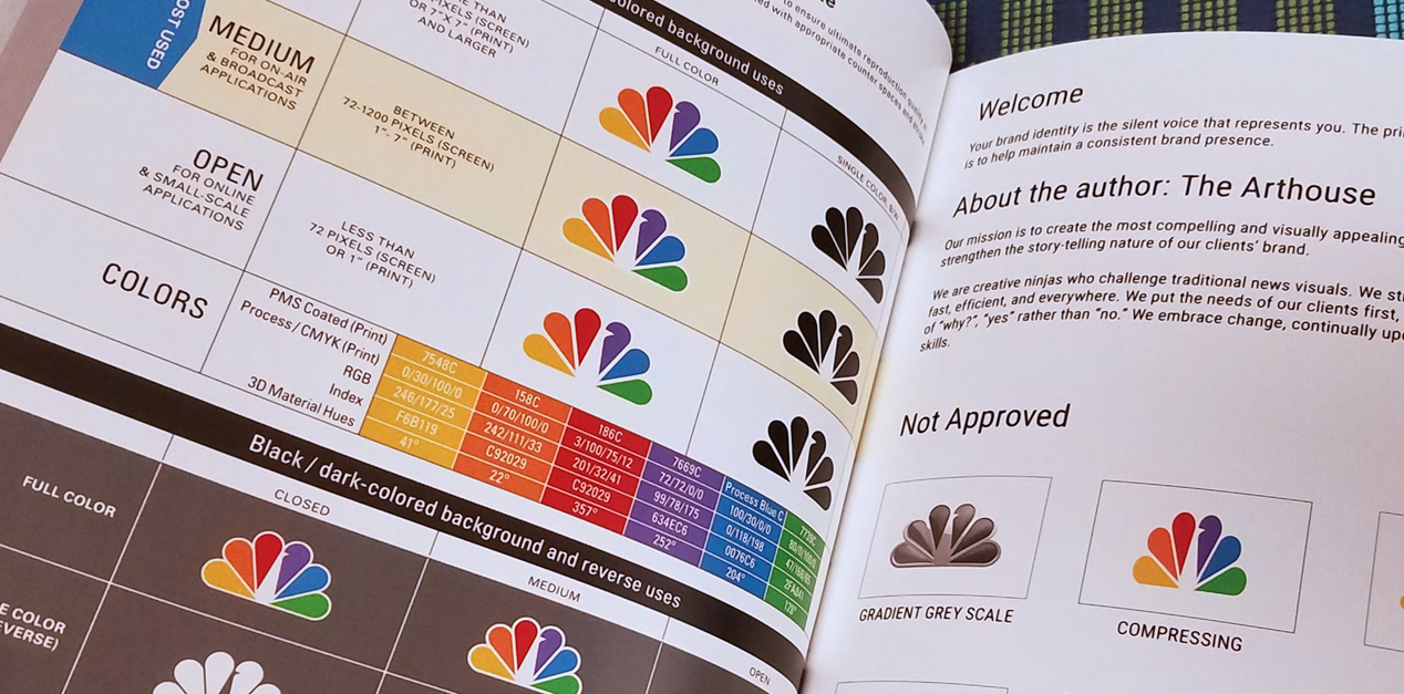
D+i was hired by The Arthouse, NBCUniversal Owned Television Station’s internal graphics department, to review their existing files, compare to original documentation of the Chermayeff and Geismar 1986 redesign and bring forward recommendations for formatting, versioning for scale and creating these versions to suit various uses.
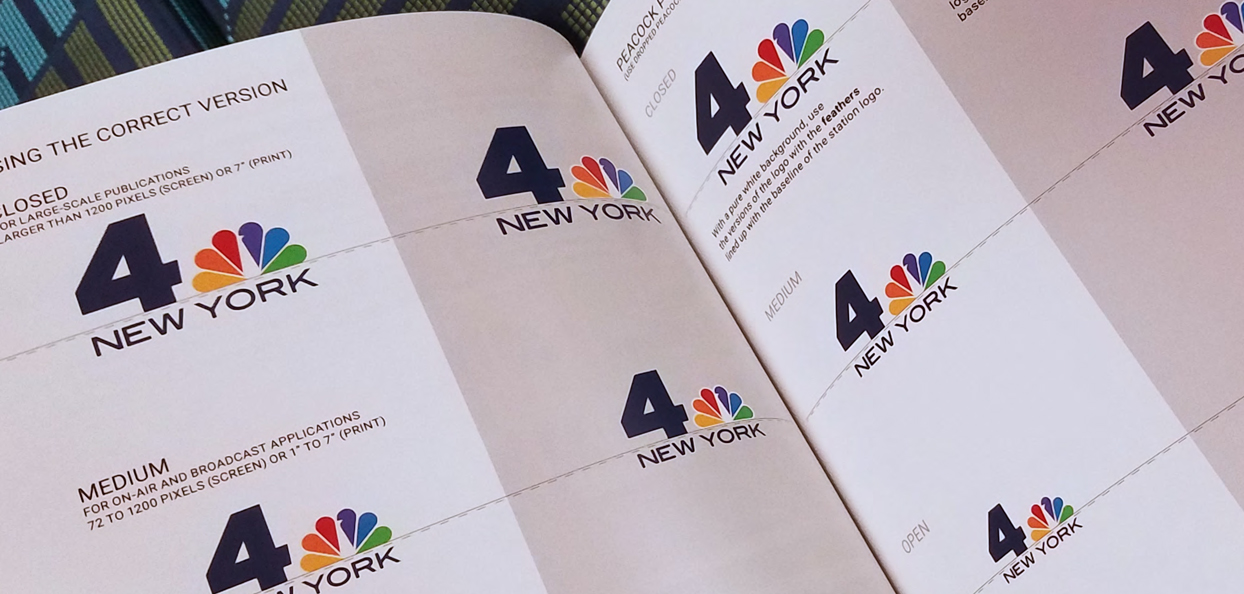
We worked in close collaboration with the resident NBC brand agent and logo historian at The ArtHouse to create 3 versions of the mark, each utilizing finely tuned negative spaces and adapted primary forms within the mark to define a balance between increased legibility and preservation of original intent. After several iterations, final versions of these files combined with recommendations for their use (based on media type and size) were delivered and wrapped into a formal guide to be distributed to stations under the NBC umbrella.
For design nerds this falls under the category of visual neuroticism at its finest. For the average viewer these subtle changes might evoke an increased feeling of quality or instill a brand takeaway that reinforces a level of professionalism for the organization it represents.