A Rebellious Team Engagement
From boring to badass
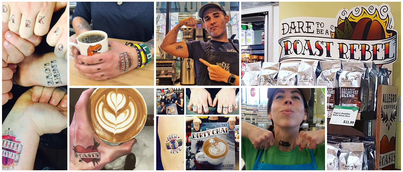
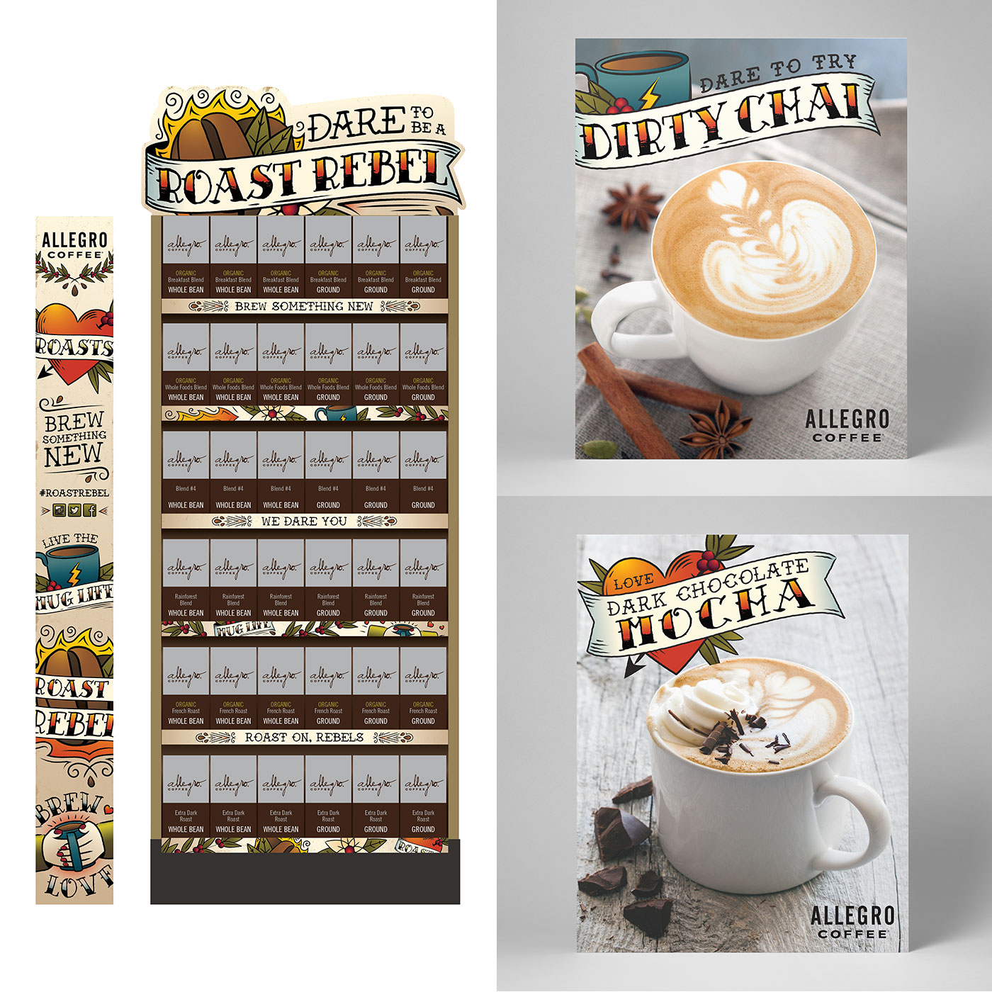
Through their seasonal promotion in Whole Foods Market, Allegro Coffee wanted to celebrate the diversity of their roast offerings. We collaborated to create a campaign encouraging consumers to take a risk by trying a new roast, brewing something new and experiencing a different flavor profile. Whole Foods team members and baristas were invited to share and encourage the rebellious spirit through cheeky temporary tattoos capturing the essence of a daring coffee experience with the hash tag #roastrebel. Roast on, rebels!
1 Minute
How to Express Daring
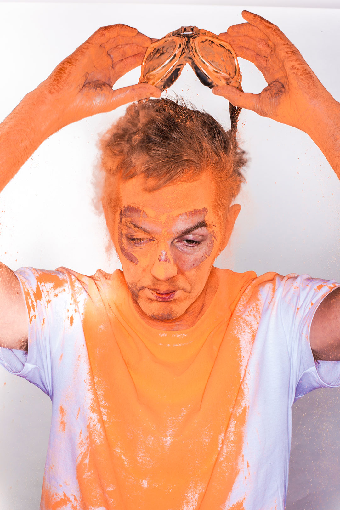
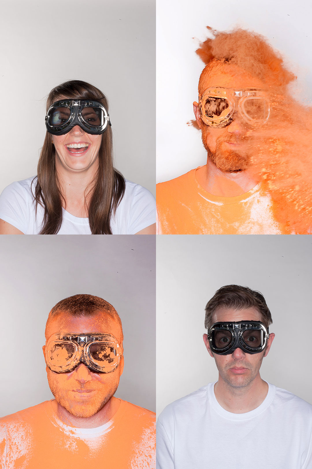
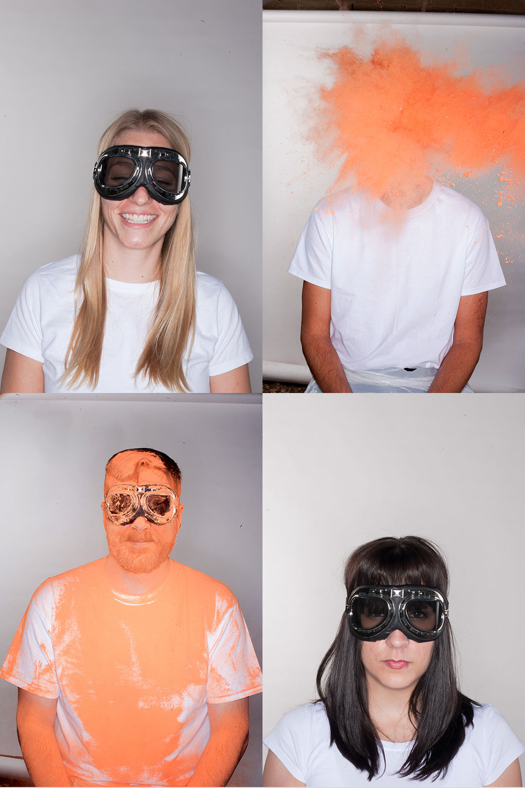
Daring to be creative
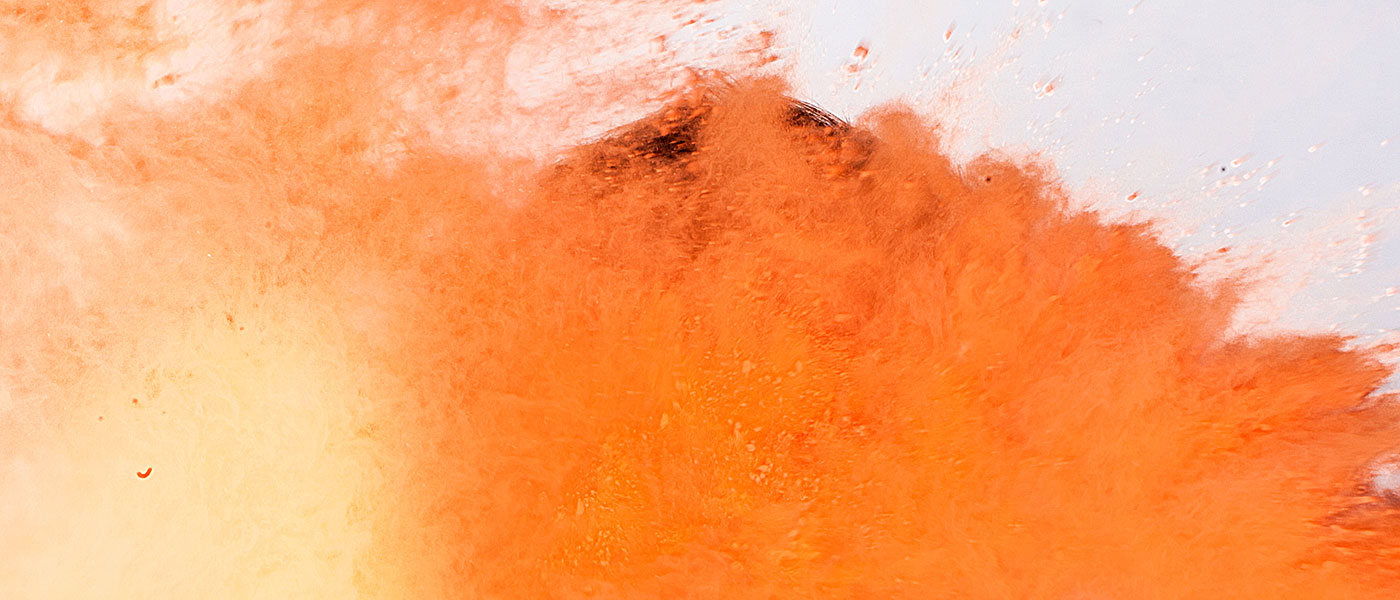
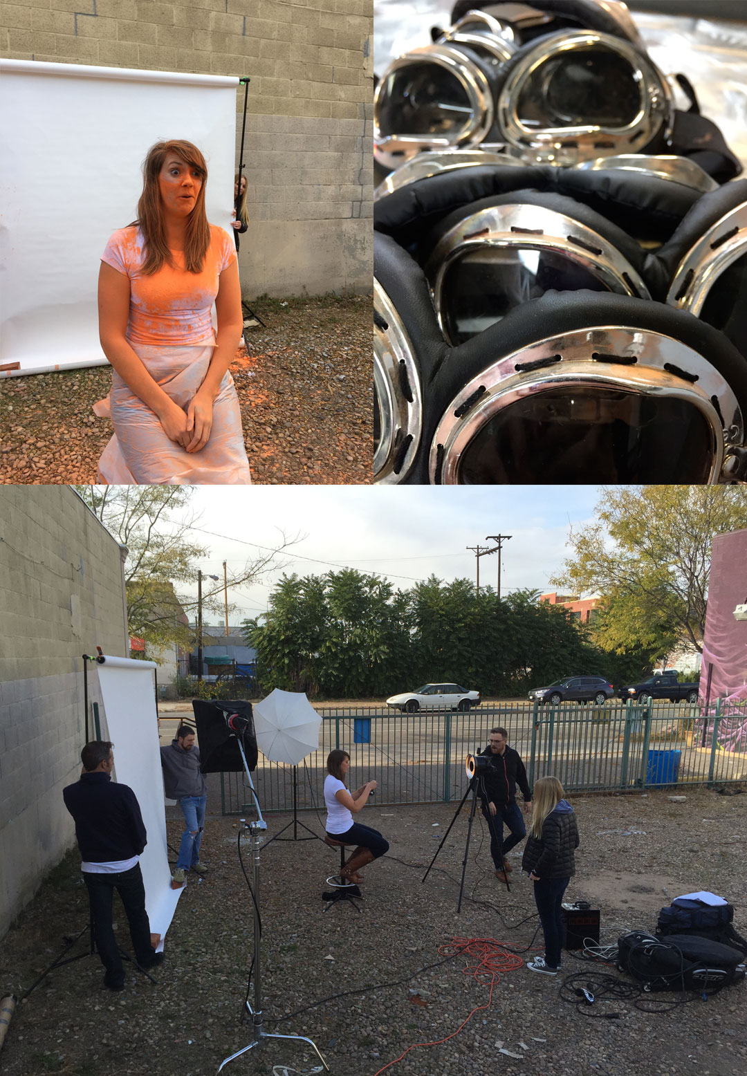
When we ask others to be daring we’d better stand behind it ourselves (or in this case in front of it). In order to create a memorable experience that connected back to our brand we came up with a unique approach for our staff profile pictures utilizing white t-shirts, goggles and a whole lot of orange powder.
Being the daredevils we are, we donned our goggles ready for action and proceeded to dive head-on into the spirit of our new brand expression. The result? One-off character-filled shots that portray a sense of daring and adventure while capturing the individual personalities of our staff. The bonus, team-building and camaraderie through shared experiences (and still finding orange powder in strange places).
Enjoy these outtakes and a glimpse into some of the behind-the-scenes action.
1 Minutes
Restaurant Website Design
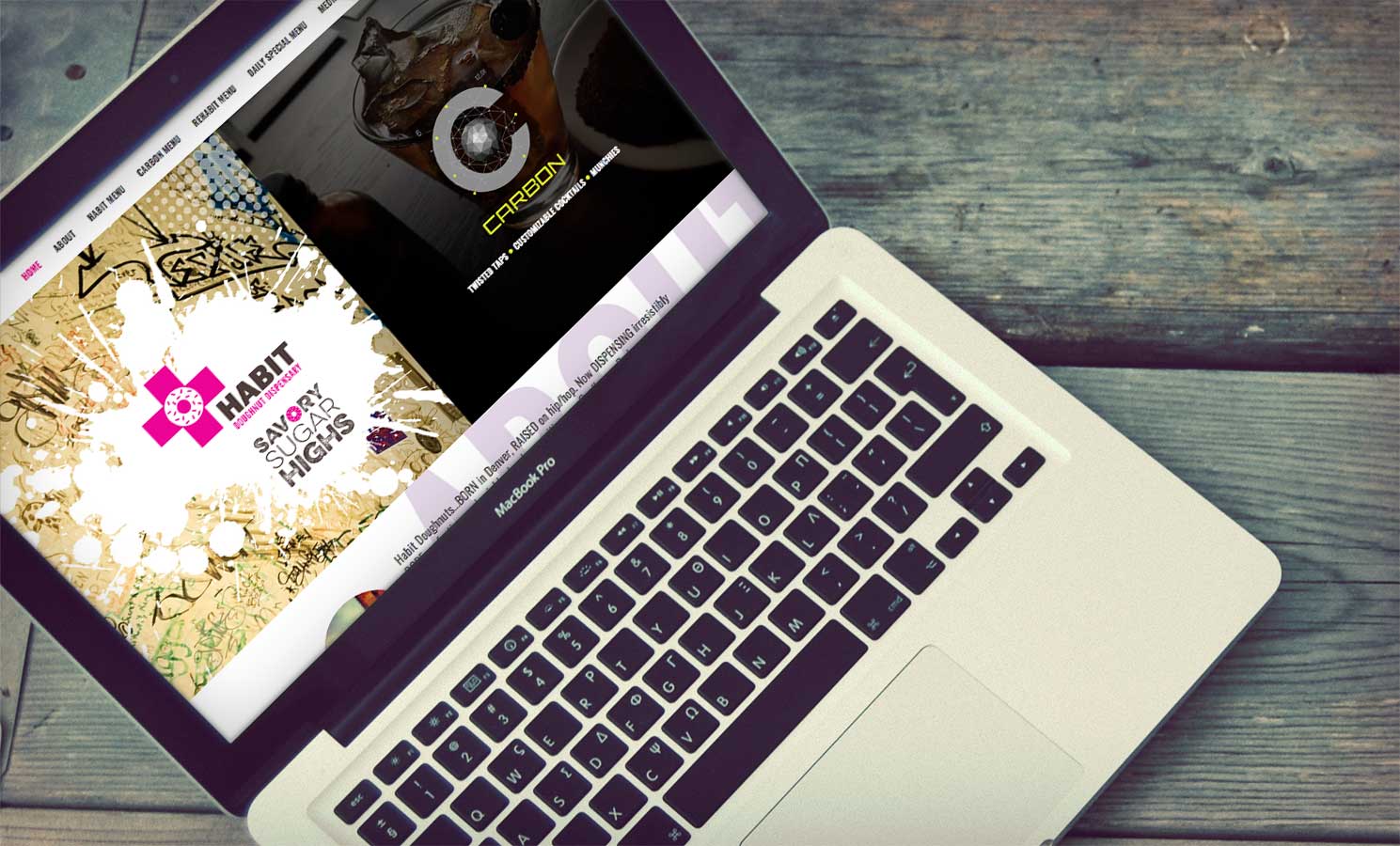
Mixing things up
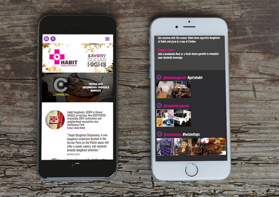
Habit Doughnut Dispensary and Carbon Beverage Cafe, a new urban doughnut shop coupled with a coffee, beverage and overall delicious eatery, needed a landing page to let everyone in on both the doughnut dispensary’s and cafe’s openings and happenings. We worked with the Habit and Carbon teams to create an edgy, urban-inspired landing page that highlighted how cutting-edge both of these new eateries are. The graffiti-inspired design did just that, while the bold, bright colors brought site visitors’ attention to the important details such as press articles and hours.
1 Minute
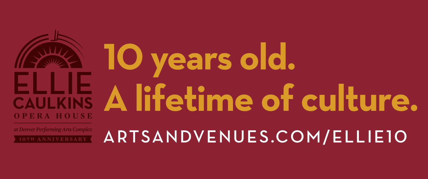
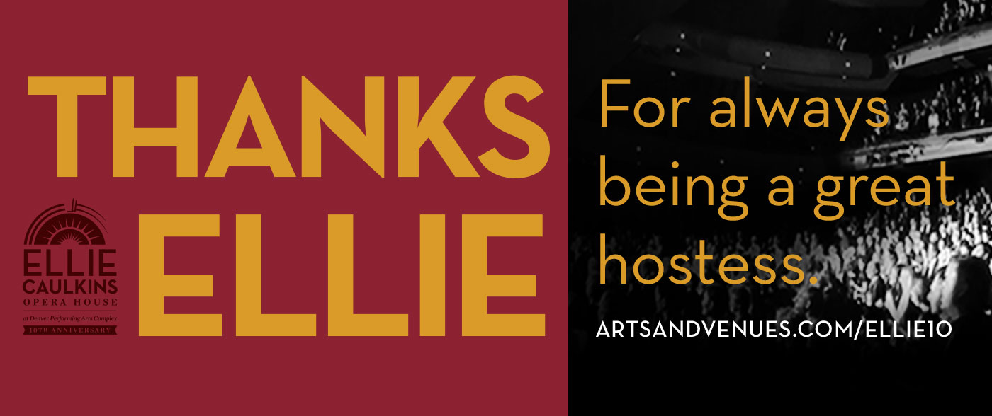
Ellie Caulkins Opera House 10th Anniversary
“Thanks Ellie”
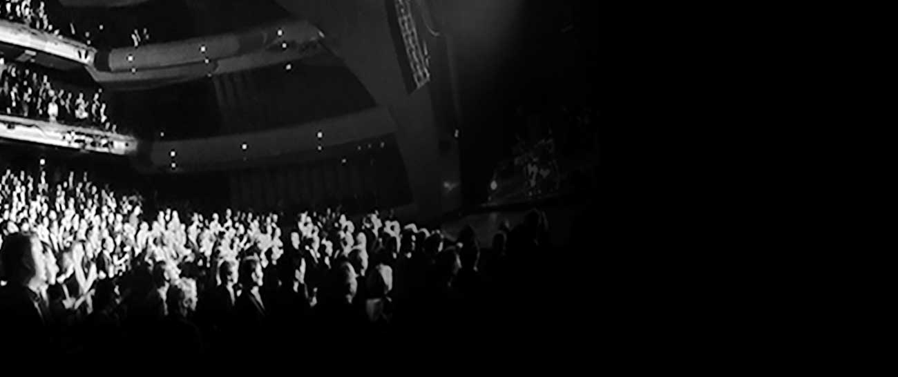
After D+i improved the logo to include 25th anniversary commemoration, A&V asked us to assist in designing a campaign to build public exposure and awareness of the iconic Ellie Caulkins Opera House. With a primary goal to direct viewers online to learn more about history of the building, new and old, through photos and a deeper story, D+i concepted an original campaign, applying an approachable personality to the venue with a more obvious nod to the namesake of the theater. Through the line, “Thanks Ellie”, we show appreciation for the benefits of wonderful performances present, past and future we are able to experience because The Ellie is there to house them.
1 Minute
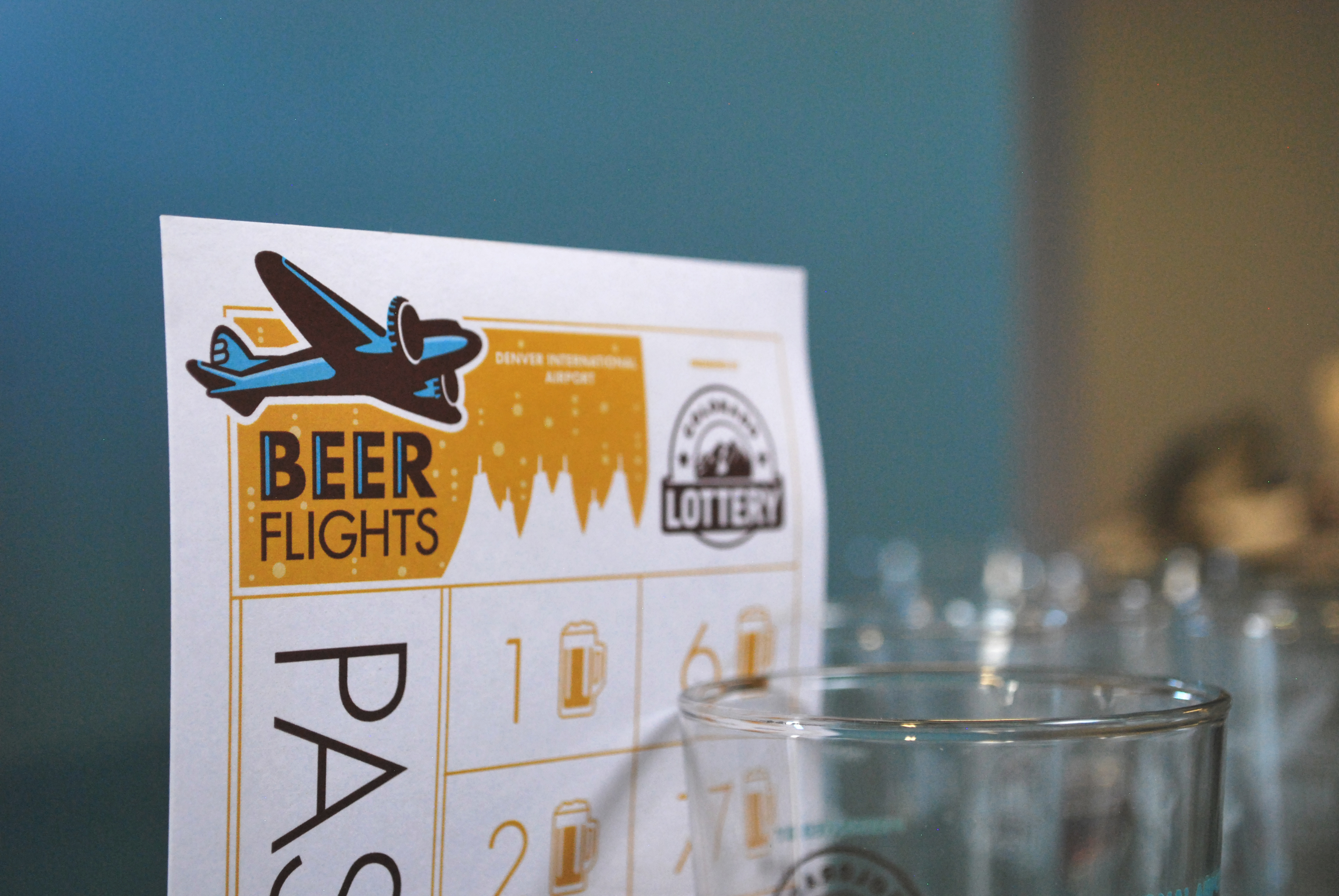
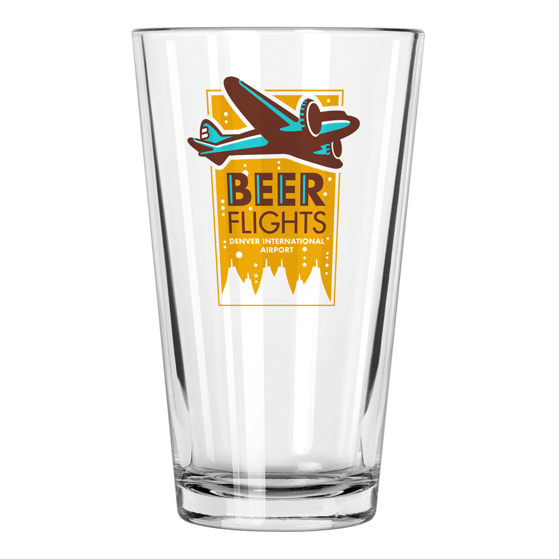
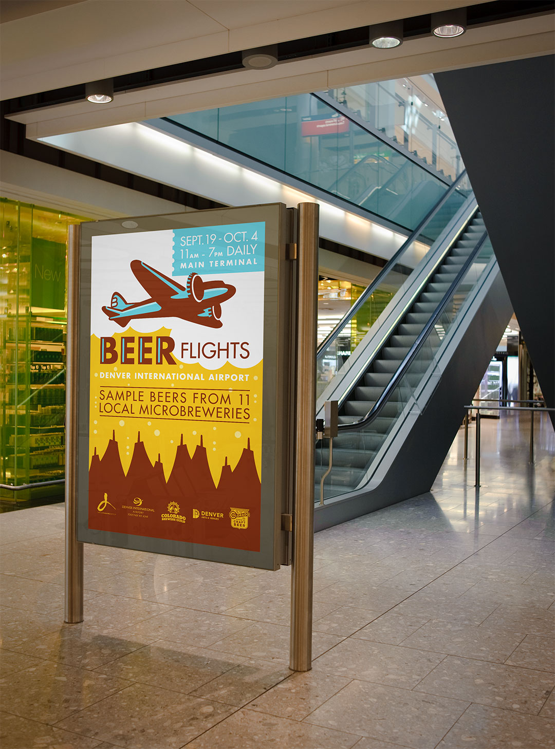
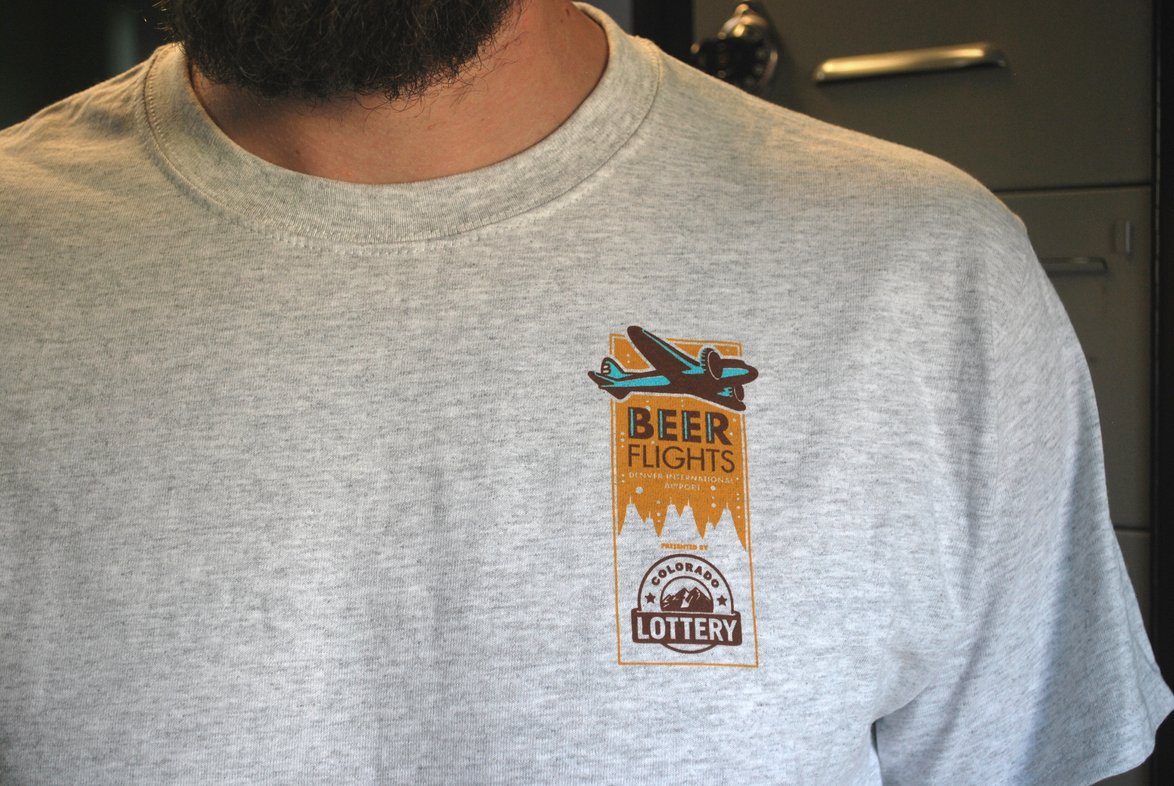
Beer Flights at DIA
Denver’s annual beer garden at DIA
Each year in early fall the Great American Beer Festival comes to town, and along with it many visitors traveling through the Denver airport. We worked closely with Denver Arts & Venues and DIA to ideate a temporary beer-tasting event at the airport called Beer Flights. Introduced by a unique identity and tied together with a warm, welcoming color palette that evokes the flavors of beer, the event has been a great success for the past two years running.
1 Minute
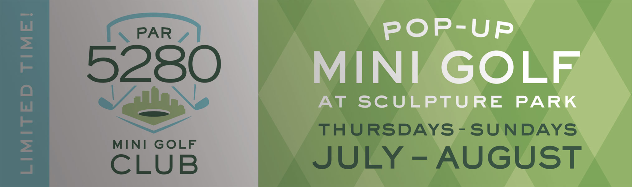
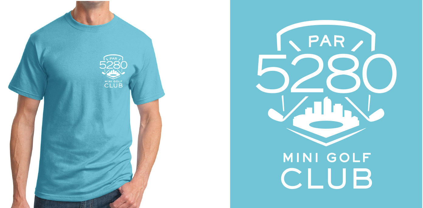
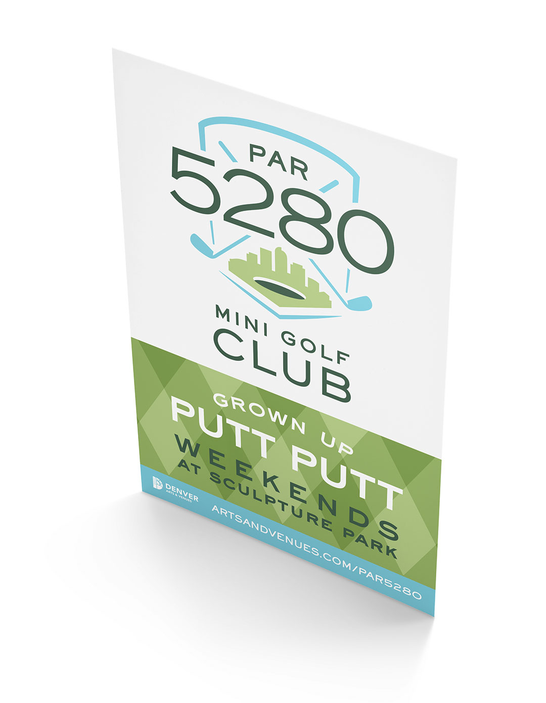
Golf at sculpture park
A Mile High Country Club Experience
D+i engaged with Denver Arts & Venues to tee up an innovative identity for their Summer 2015 pop-up golf event in Denver’s Sculpture Park. Infusing elements of the Mile High City with a distinctly playful country club aesthetic, we named the event and created all identity, marketing, event and advertising collateral, encouraging families to pop that collar, put on some plaid and show off their putting skills at Par 5280 Mini Golf Club.
1 Minute
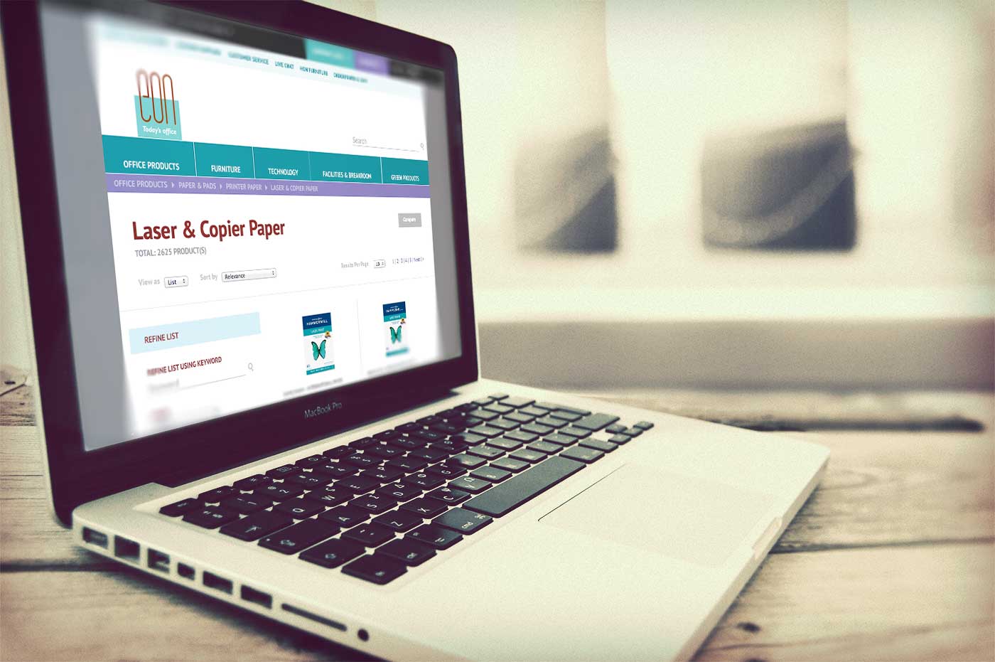
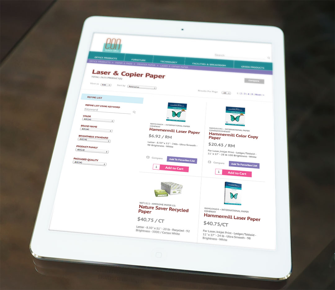
EON Office eCommerce UI
Creating an easier ordering process
We value and enjoy our ongoing partnership with EON Office that has spanned more than 7 years.
We’ve refreshed their brand expression and subsequent redesigns of their website, marketing and sales collateral, but the online office supply ordering system for customers remained a fragmented visual experience from the EON brand and digital presence. When EON upgraded their eCommerce system to include an improved graphic interface, they asked us to aid in customizing the design for a better customer experience.
When challenged to retrofit designs into a primarily established online store, we improved navigability by establishing consistent UI styles, restructuring elements based on eCommerce best practices and ensuring continuity to the brand through use of familiar color palette, fonts and styling. After a rigorous quality assurance process with developers, the improved store was introduced to customers. Easy access to key functionality with a user experience consistent with the brand they have come to rely on for their office needs makes daily interactions smooth and seamless.
1 Minutes
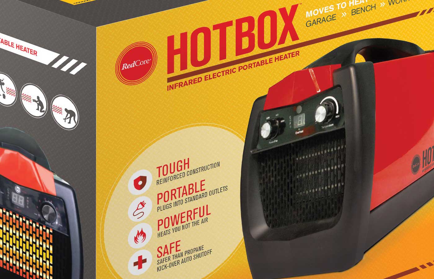
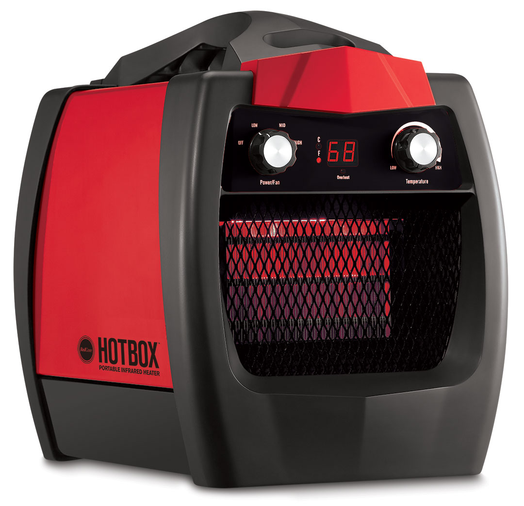
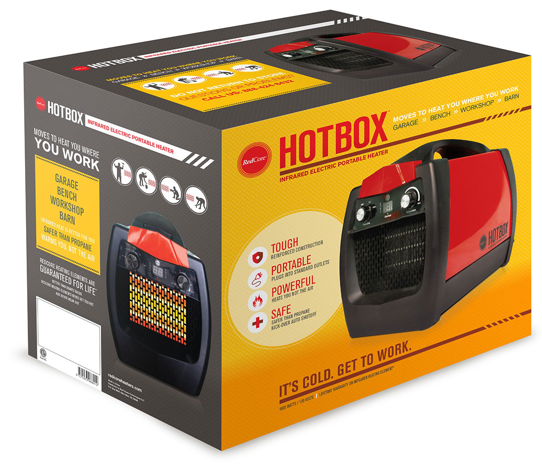
RedCore Hotbox Packaging Design
A portable heater specifically designed and built to serve the “workshop” market
Infrared heating manufacturer Redcore approached D+i with the challenge to name and design retail packaging for their latest product, a portable infrared heater featuring a highly functional design.
Aiming to break through the appliance packaging rut, we positioned the HotBox as reliable, rugged and purpose-built for work. Targeting the tinkerers, weekend warriors and craftsmen, we focused our collective heat to create innovative packaging that emphasized product design, highlighted engineering benefits with an industrial feel and presented the product as a tough, effective piece of equipment. Bright, energetic colors paired with bold language and intentional product renders wow the consumer with functionality, portability and benefits. Retailers had not yet seen a portable heater specifically designed and built to serve the “workshop” market, and we capitalized on this opportunity by positioning the HotBox as a rugged, smart, safe and efficient heater for the garage, a truly disruptive stance among the portable heater marketplace.
1 Minutes
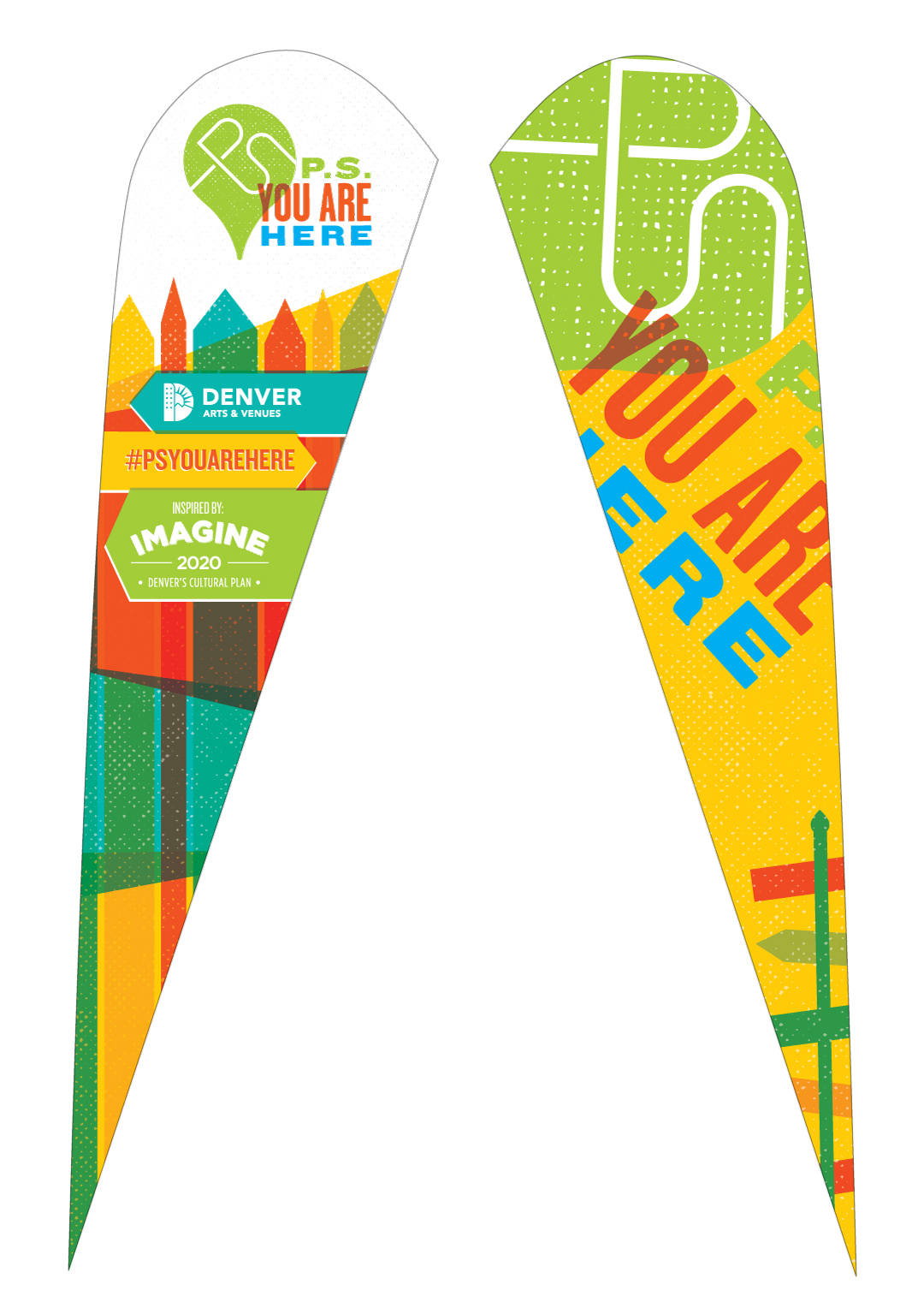
P.S. You are Here
A community coming together
The City of Denver’s Budget and Management Office and Denver Arts & Venues (A&V) partnered to develop P.S. You Are Here, a citywide placemaking fund, cultivating community-driven, tangible outdoor projects in Denver.
The P.S. You Are Here matching grant was designed to encourage community members to claim, initiate and drive the creation of temporary, authentic demonstrations and activation of public spaces.
While the initiative didn’t require a full-blown standalone brand, A&V approached D+i to create a mark and promotional banners for the program. The resulting creative captures the urban essence of the program through gritty texture with a nod to the placemaking element through an abstraction of a map marker and city streets, with a secondary read as a light bulb to represent bright ideas. Vibrant colors project the forward-thinking nature of the program, completing a mark that is worthy of the transformation and revitalization PS You Are Here brings to our underutilized urban spaces.
1 Minutes
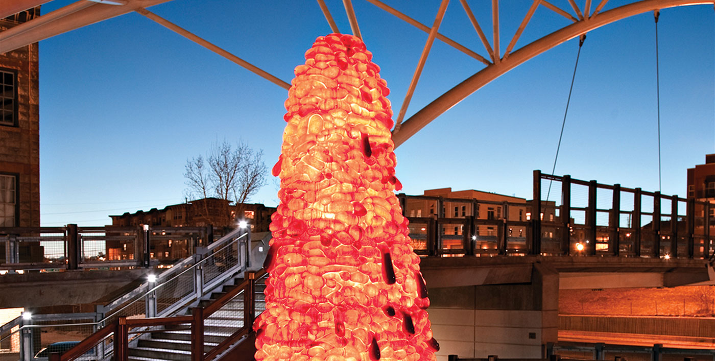
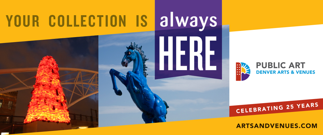
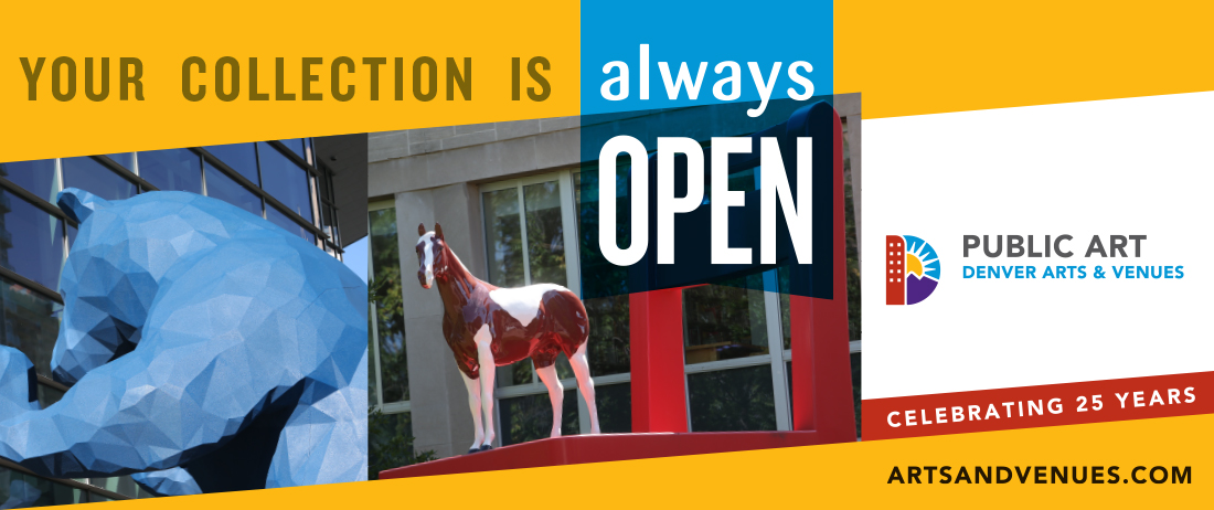
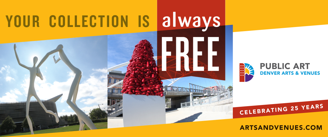
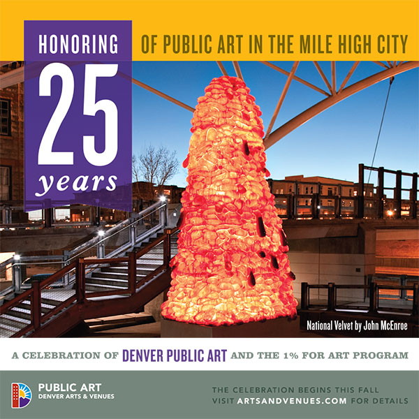
Denver Public Art Identity
World-class art
When Denver’s Public Art Program turned 25, Denver Arts & Venues reached out to D+i to update, refresh and rejuvenate the brand to better define the program, highlight the benefits, and challenge the public to get involved. We crafted a campaign design including marquees, advertising and digital assets led by the functional tagline, your collection, expressly highlighting that the Public Art Program is the easiest way for anyone to experience a free, accessible collection of world-class art.
1 Minute