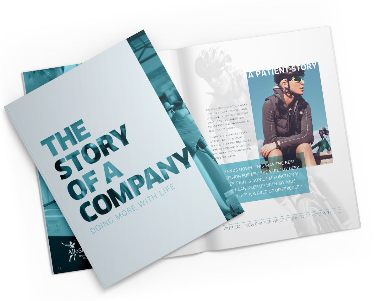
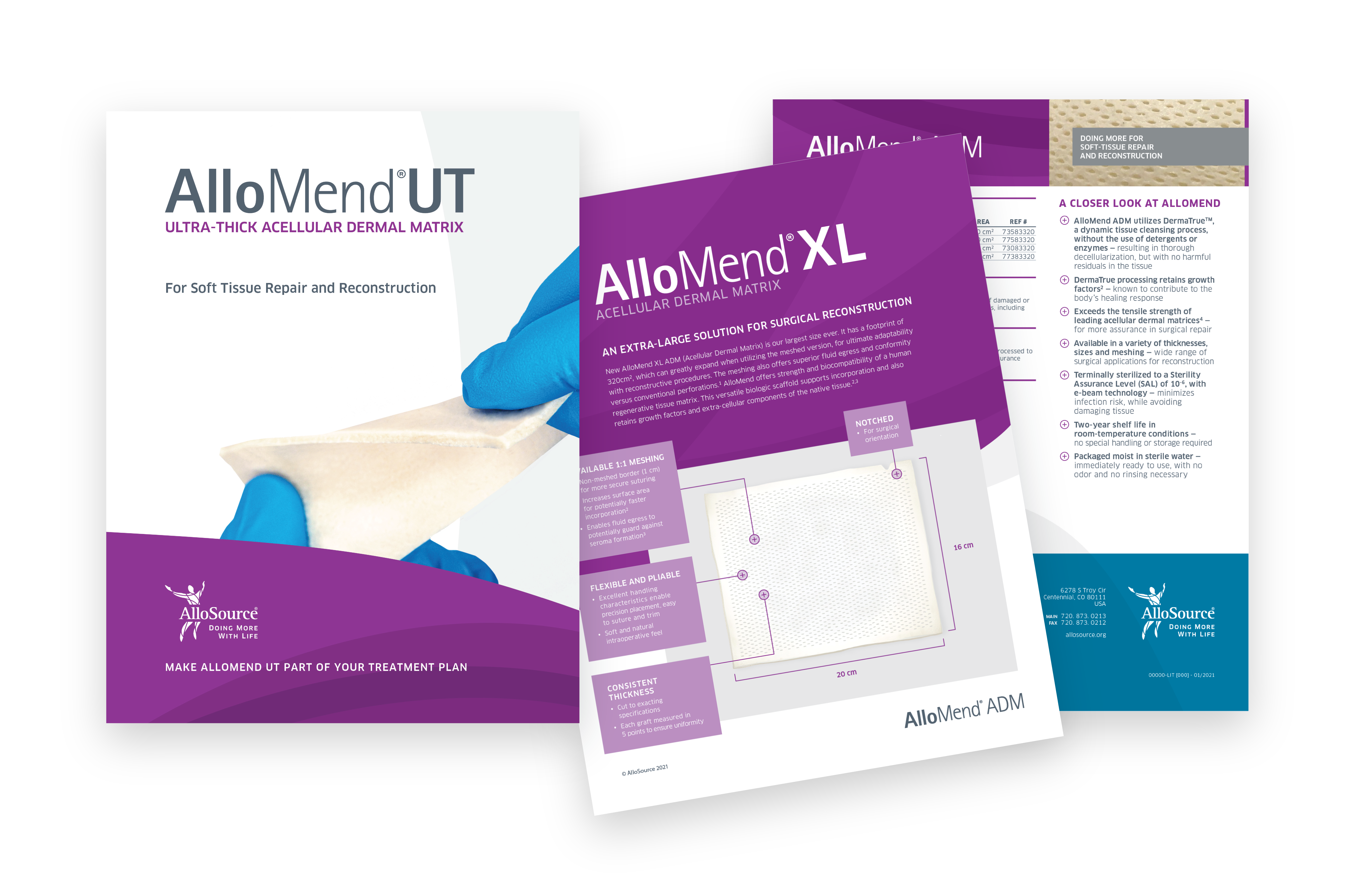
Vibrant, yet sterile
The tissue-based products that AlloSource creates present a unique visual challenge. They need to be represented in a medically accurate fashion while also becoming a part of a layout that portrays the dynamic delivery and service attributes of the AlloSource brand. Using a consistent blue-glove style to hold each product creates a sense of scale, clinical sterility and brings a human aspect to the product photography. Using clean white backgrounds that contrast with vibrant color fields and dynamic patterning creates a distinctive and modern look that balances the line between eye-catching and trustworthy professional.
A shift from
“we” to “you”
With the knowledge that this marketplace contains a lot of pride of ownership in the often life-saving products that are created it became apparent that there were many confident claims from competitors about what “we” do for you and to improve the lives of others.
In order to differentiate from competition speaking from this self-justifying (we) perspective D+i proposed a distinct position in the market that instead comes from a supportive angle talking more directly to the valuable work that the surgeons and hospital partners (you) do.
This distinguished approach informs how AlloSource appeals to each audience type from a place that pays respect to the life-changing work that they do and illustrates how AlloSource products enable them to do it.
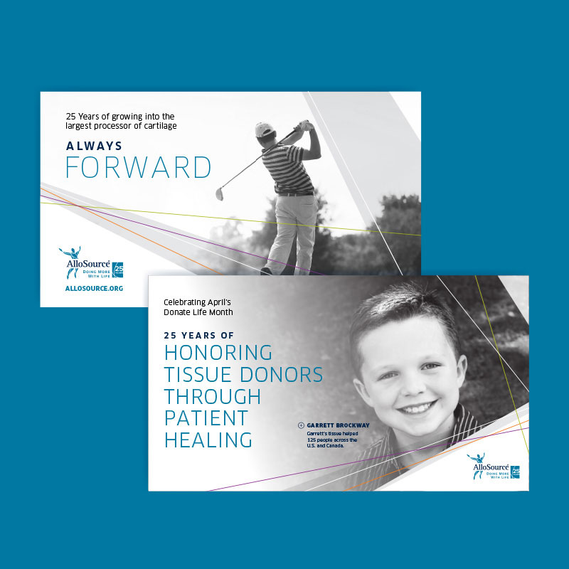
Staying fresh and creating consistency
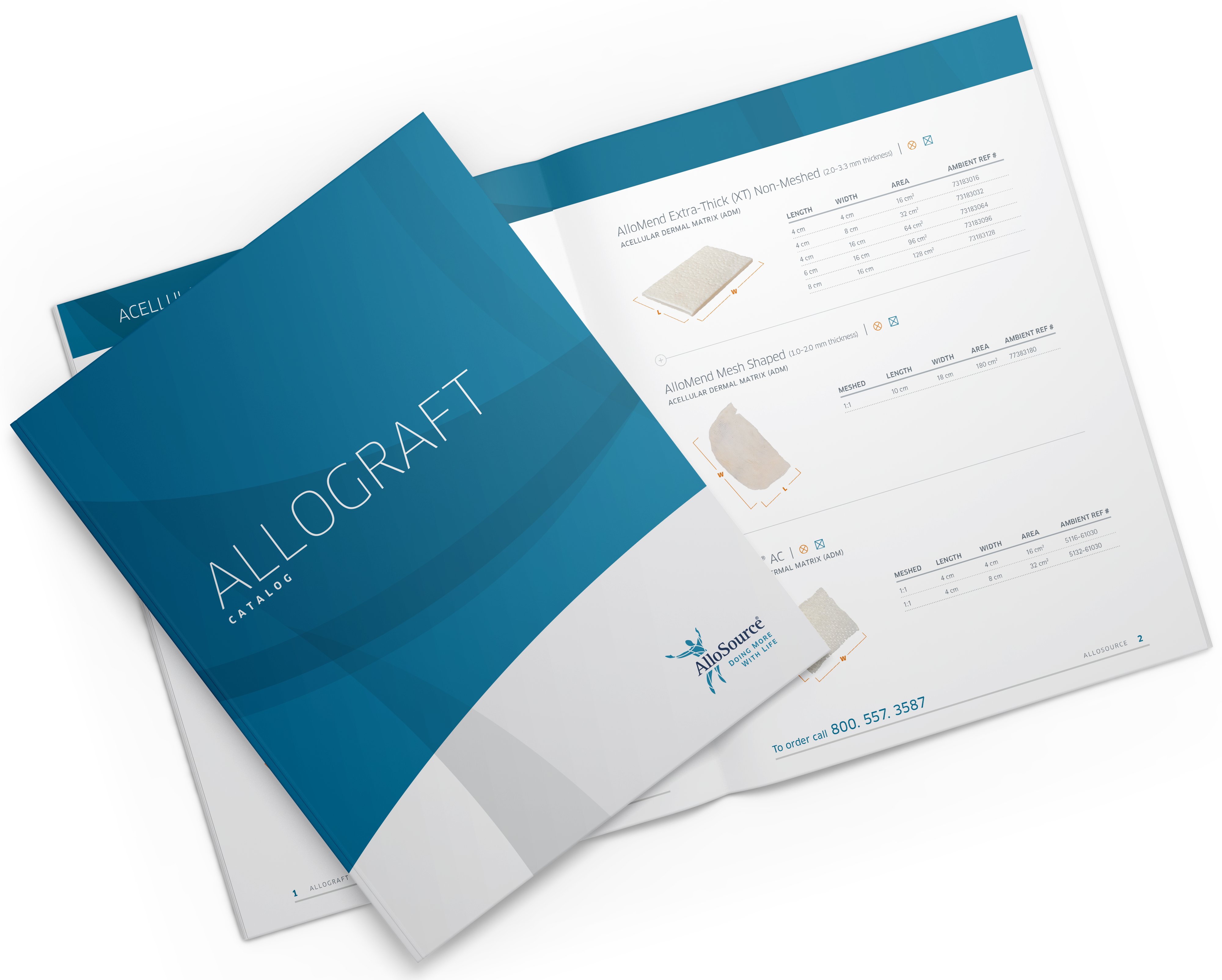
Due to the large catalog of products across multiple audience types AlloSource is a brand that requires a well-guided approach to each and every aspect of their marketing collateral and outreach in order that they successfully appeal to specific groups on their level, and also maintain a consistent brand image companywide.
We worked with the AlloSource team to create refreshed primary brand elements, refined color palettes, photographic styling, dynamic patterning and a tone of voice that allows for a constant creation of marketing assets in a timely manner and negates the need for an extended design process each time.
D+i also built out a comprehensive brand standards document that maintains alignment between every aspect of visual and verbal execution, while also providing the ability to flex and accommodate the needs of multiple audiences and product types.