

Intentional pause
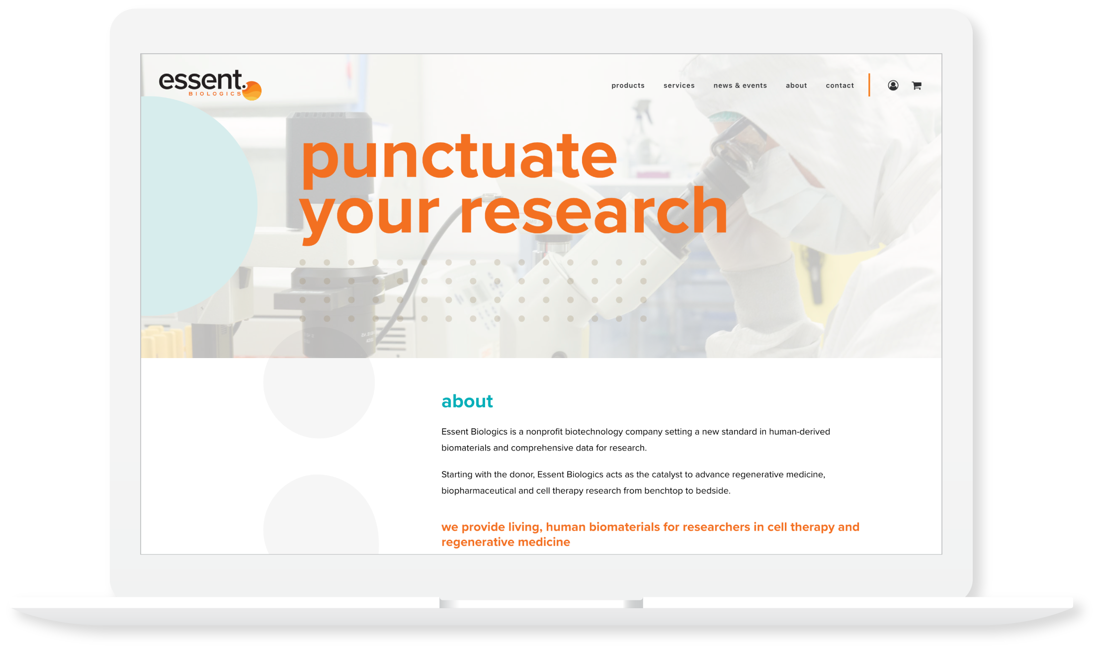
Through a unique visual identity we describe the importance of selecting the best starting point for research, using a provocative period at the end of the name combined with concepts of cellular product. The icon portrays these themes in an integrated way designed to resonate with researchers by evoking familiar Petri dish and microscope views. The concept of a “punctuated” starting point is further reinforced by the tagline which tees up the theme of punctuation and intentional pause throughout the content.
User Relevance
The last thing a researcher wants are more hoops to jump through. Simple interface design combined with brand photography familiar to the audience creates a user-friendly online environment that gets the researcher to the answers they need quickly on this first-phase site. As product offerings increase we continue to work with the client team to develop a sophisticated approach to ordering product that supports the same principles.
Consistent extension
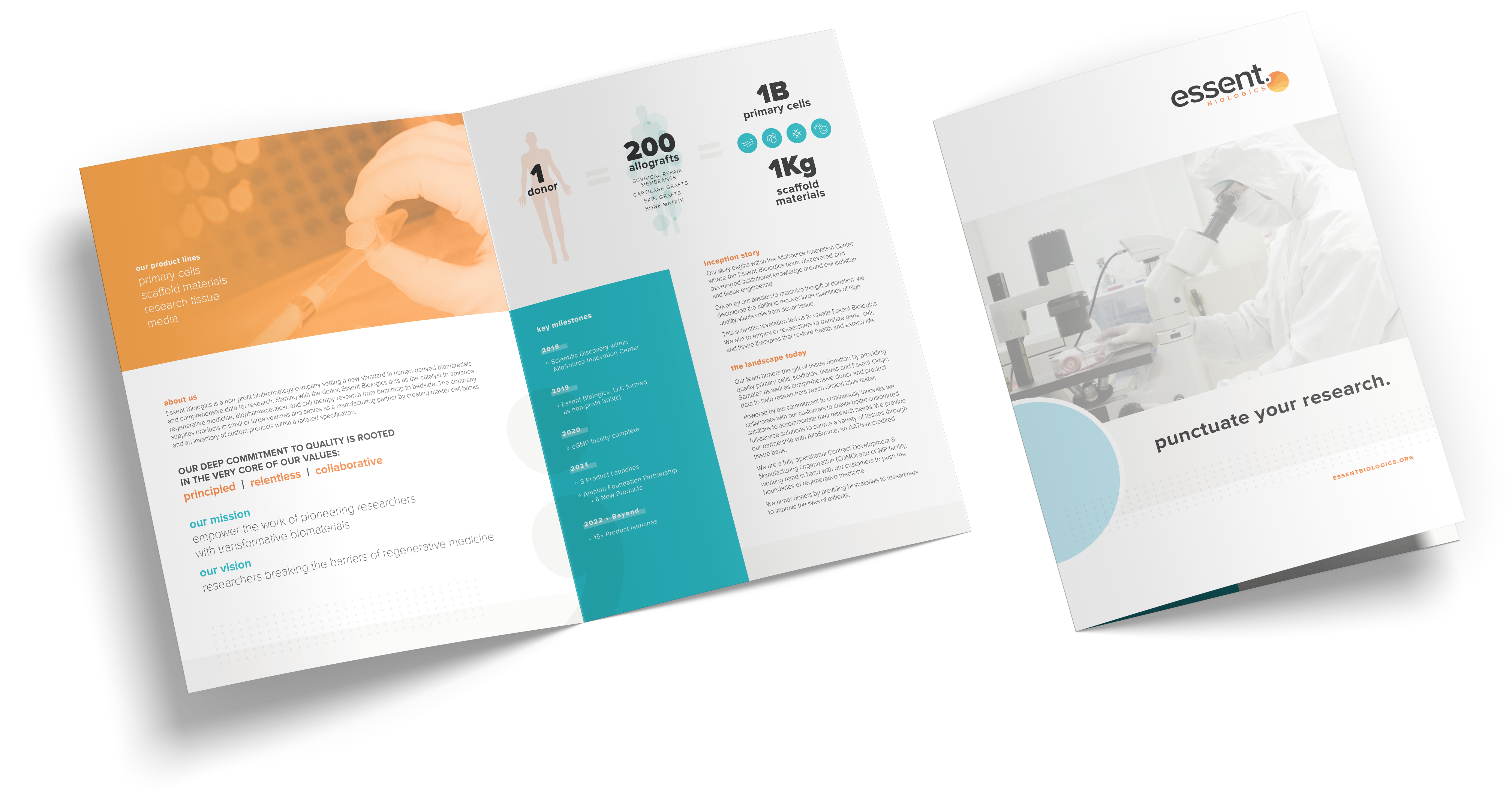
For a growing brand it becomes particularly important to maintain consistency in consumer interactions through successful visual and verbal executions that maintain a similar tone, feel and brand voice. We built a set of brand assets for the Essent team that would kick their initial product launches into gear and an adaptable set of guidelines to inform the future executions to come.