Creating an easier ordering process
We value and enjoy our ongoing partnership with EON Office that has spanned more than 7 years.
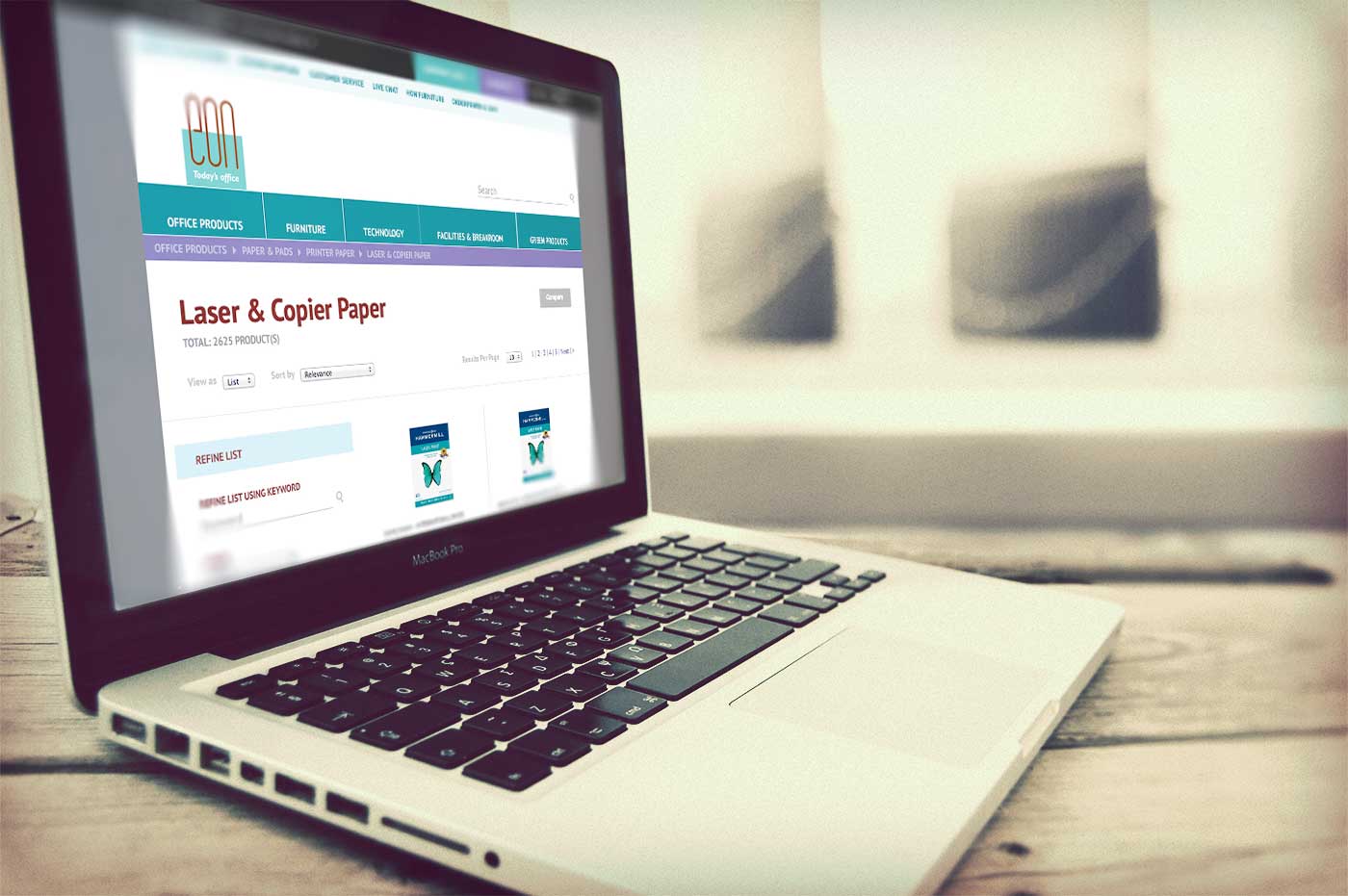
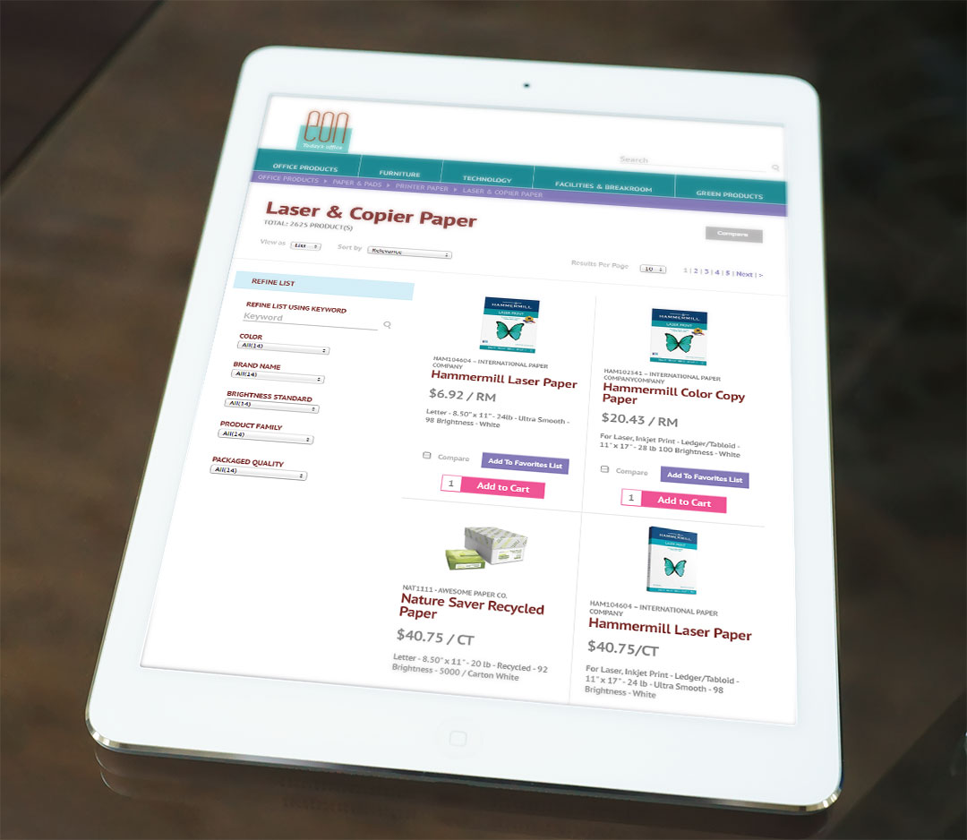
We’ve refreshed their brand expression and subsequent redesigns of their website, marketing and sales collateral, but the online office supply ordering system for customers remained a fragmented visual experience from the EON brand and digital presence. When EON upgraded their eCommerce system to include an improved graphic interface, they asked us to aid in customizing the design for a better customer experience.
When challenged to retrofit designs into a primarily established online store, we improved navigability by establishing consistent UI styles, restructuring elements based on eCommerce best practices and ensuring continuity to the brand through use of familiar color palette, fonts and styling. After a rigorous quality assurance process with developers, the improved store was introduced to customers. Easy access to key functionality with a user experience consistent with the brand they have come to rely on for their office needs makes daily interactions smooth and seamless.

