Mobile Work Order Management
Moving from into a digital age
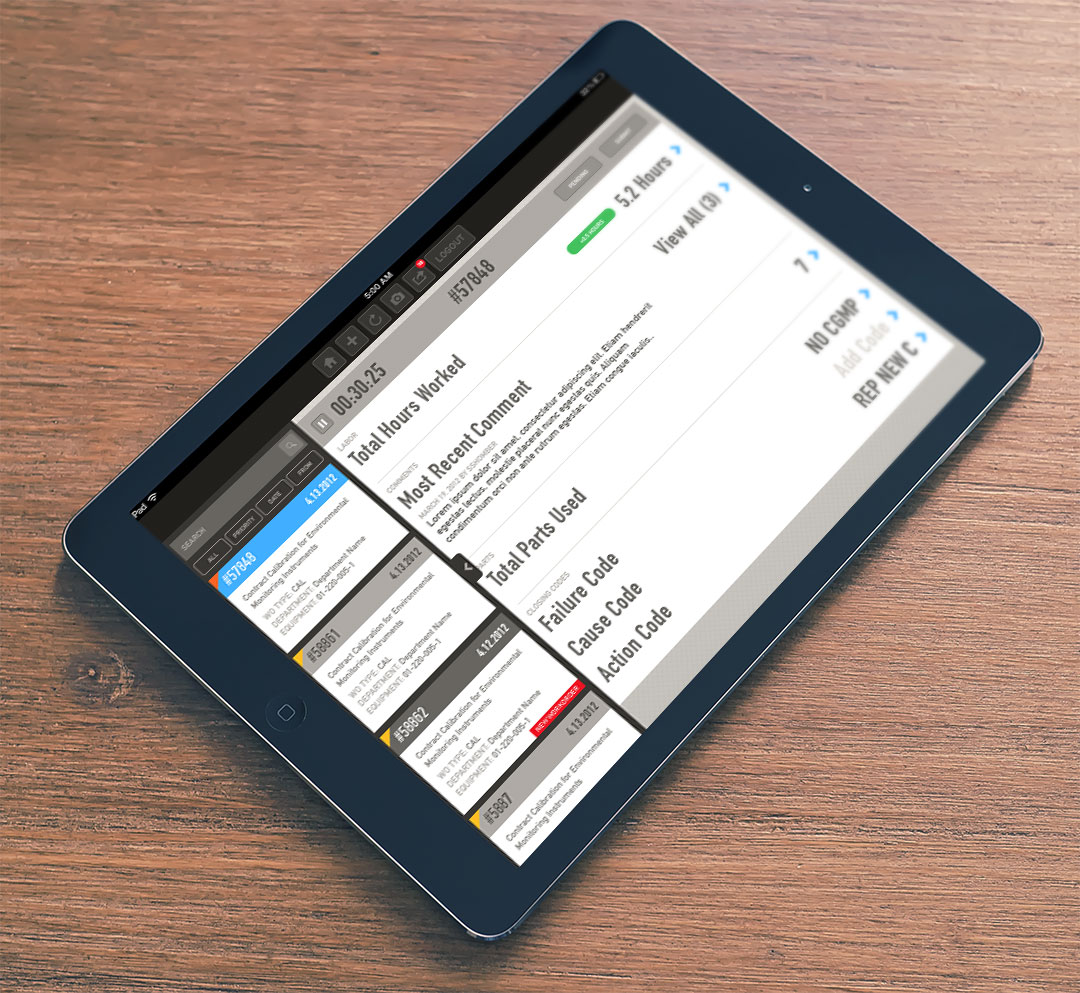
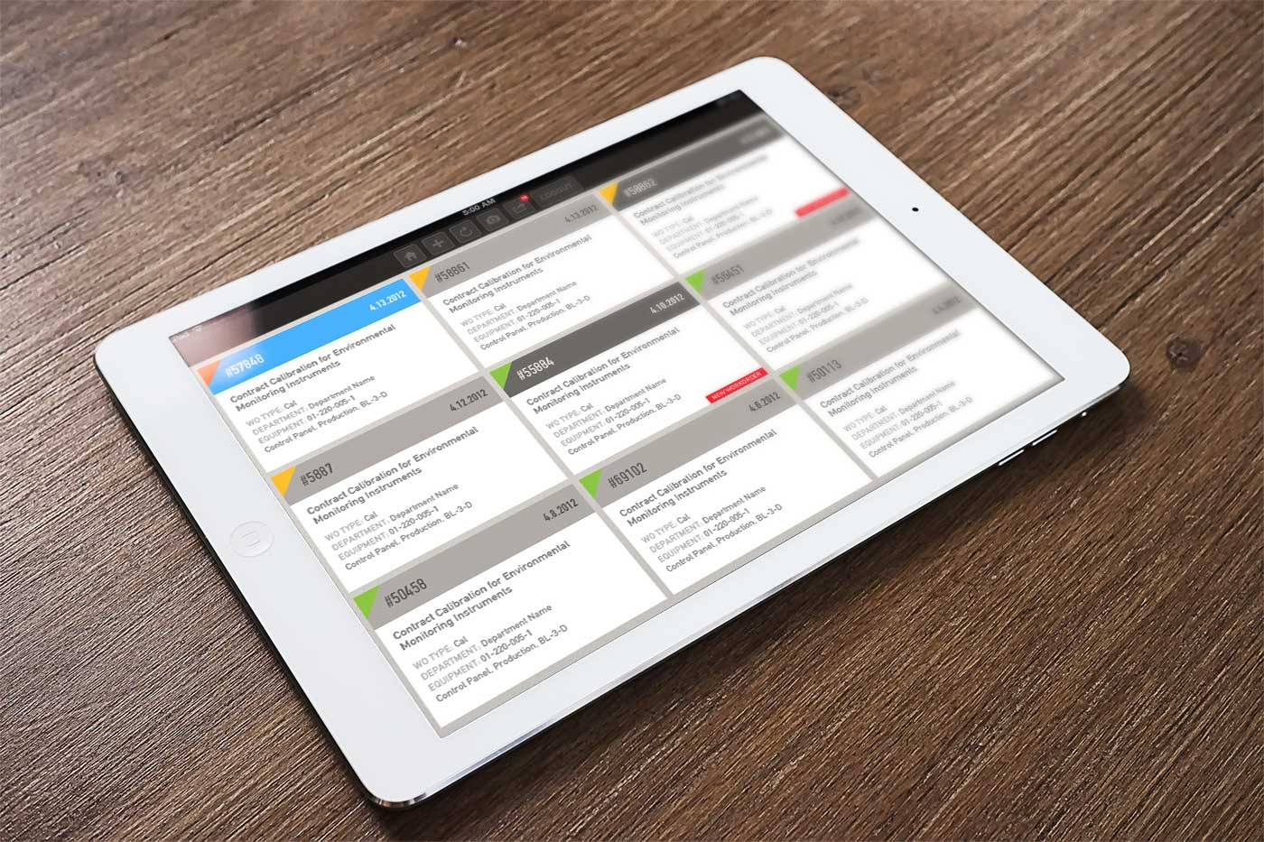
Our client, Bluedot, was tasked to build a mobile work management application to replace legacy paper systems for a technical workforce.
Previously, workers had to record their progress, needed parts and issues on the job site using cumbersome paper forms. This lead to inaccuracies and often incomplete work orders.
We collaborated with the client team to design a user experience and interface design that allowed the technicians to easily access their work orders and complete them on a tablet device. Our engagement included user persona development, application UX design and UI design for a native iPad application.
1 Minute
Restaurant Website Design
Mixing things up
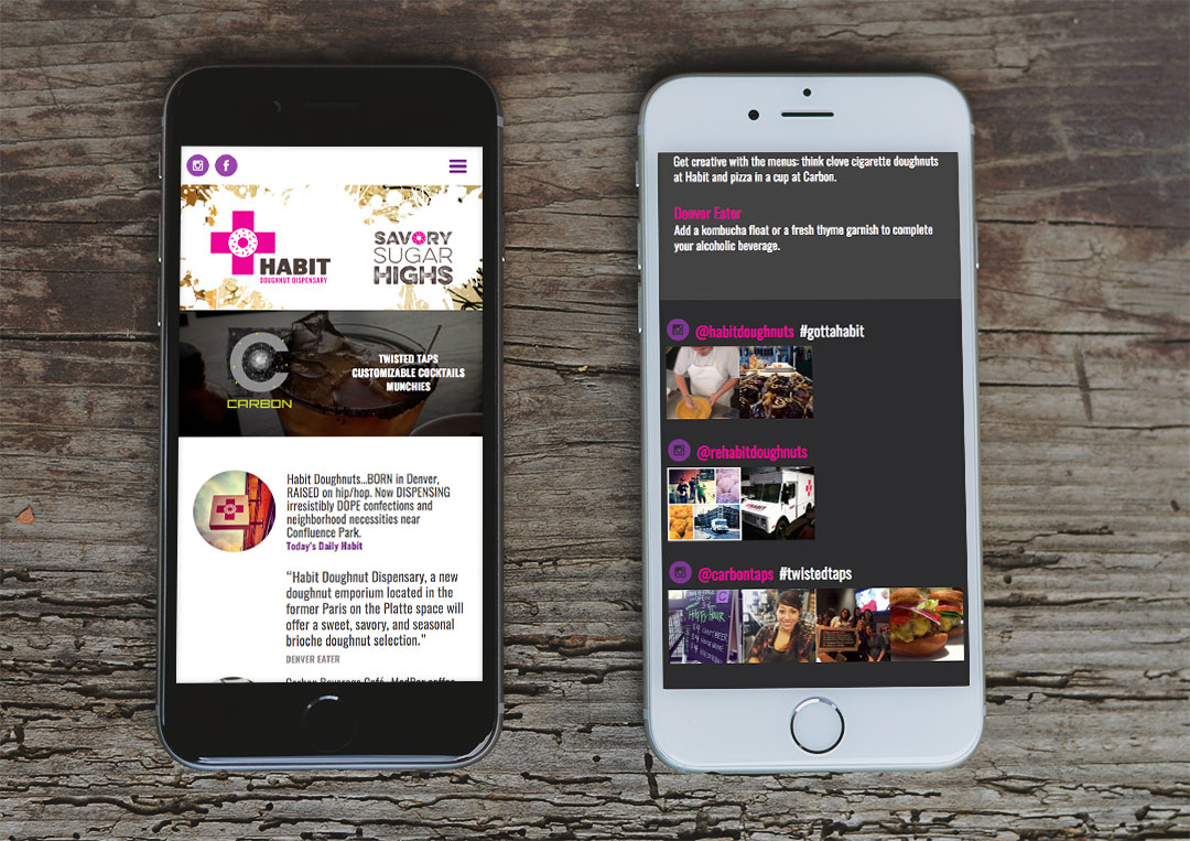
Habit Doughnut Dispensary and Carbon Beverage Cafe, a new urban doughnut shop coupled with a coffee, beverage and overall delicious eatery, needed a landing page to let everyone in on both the doughnut dispensary’s and cafe’s openings and happenings. We worked with the Habit and Carbon teams to create an edgy, urban-inspired landing page that highlighted how cutting-edge both of these new eateries are. The graffiti-inspired design did just that, while the bold, bright colors brought site visitors’ attention to the important details such as press articles and hours.

1 Minute
EON Office eCommerce UI
Creating an easier ordering process
We value and enjoy our ongoing partnership with EON Office that has spanned more than 7 years.
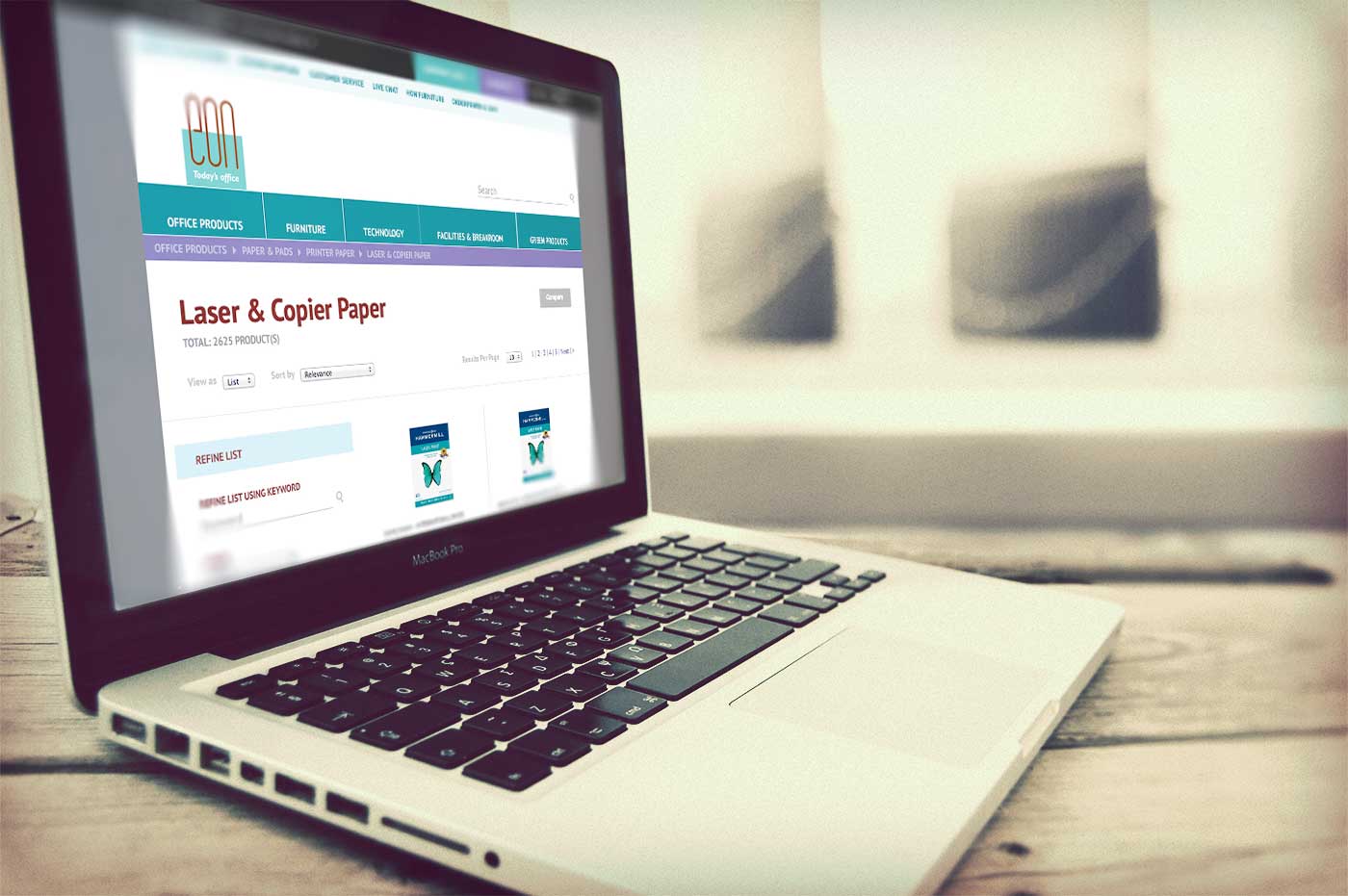
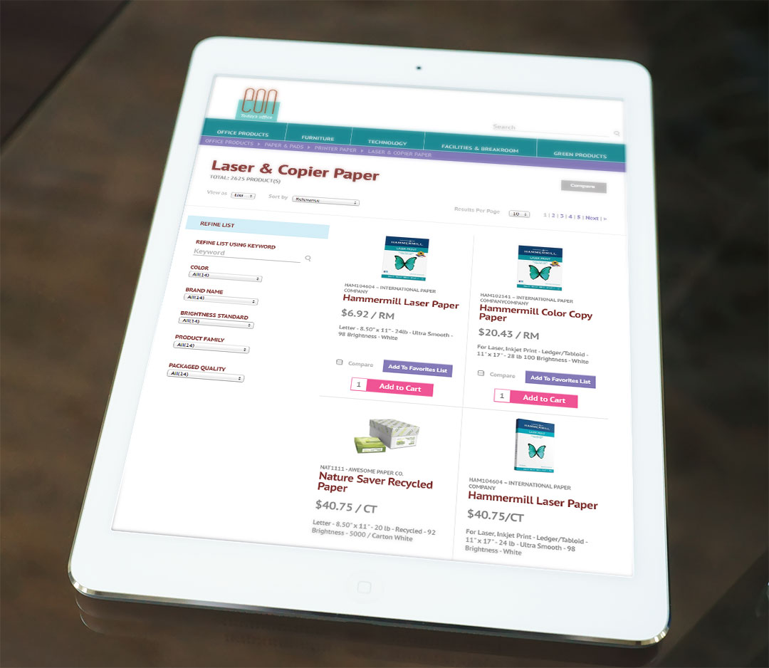
We’ve refreshed their brand expression and subsequent redesigns of their website, marketing and sales collateral, but the online office supply ordering system for customers remained a fragmented visual experience from the EON brand and digital presence. When EON upgraded their eCommerce system to include an improved graphic interface, they asked us to aid in customizing the design for a better customer experience.
When challenged to retrofit designs into a primarily established online store, we improved navigability by establishing consistent UI styles, restructuring elements based on eCommerce best practices and ensuring continuity to the brand through use of familiar color palette, fonts and styling. After a rigorous quality assurance process with developers, the improved store was introduced to customers. Easy access to key functionality with a user experience consistent with the brand they have come to rely on for their office needs makes daily interactions smooth and seamless.
1 Minutes